THE
CELLAR
CHURCH
The Challenge
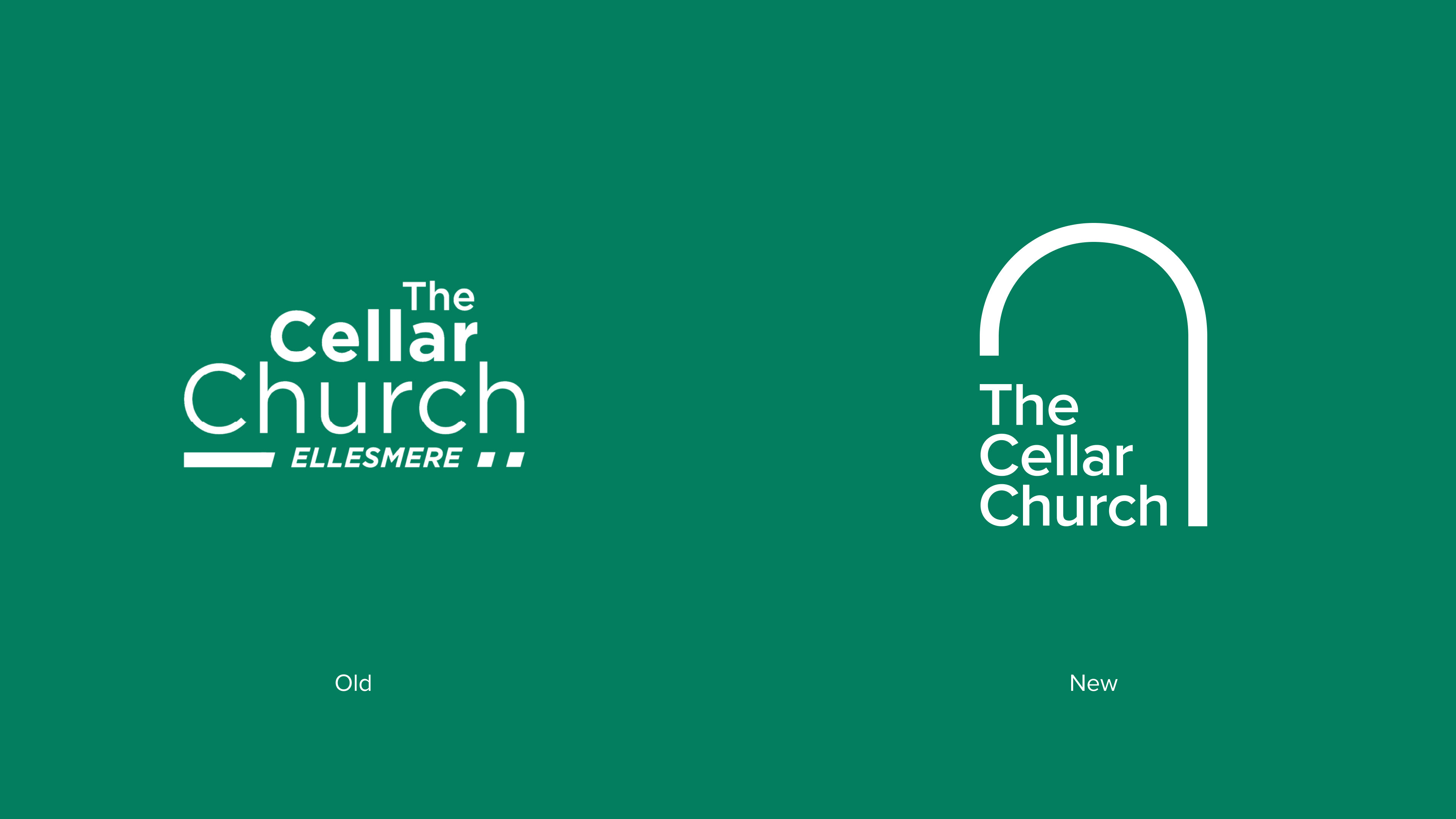
The Cellar Church had a strong mission but a fragmented visual identity. Over time, the brand had become inconsistent across different platforms, leading to a diluted professional image. The task was to take their existing "spirit" and refine it into a cohesive design system that could appeal to a younger demographic without alienating the core congregation.
The Strategic Solution
The focus was on Visual Clarity and Digital Scalability:
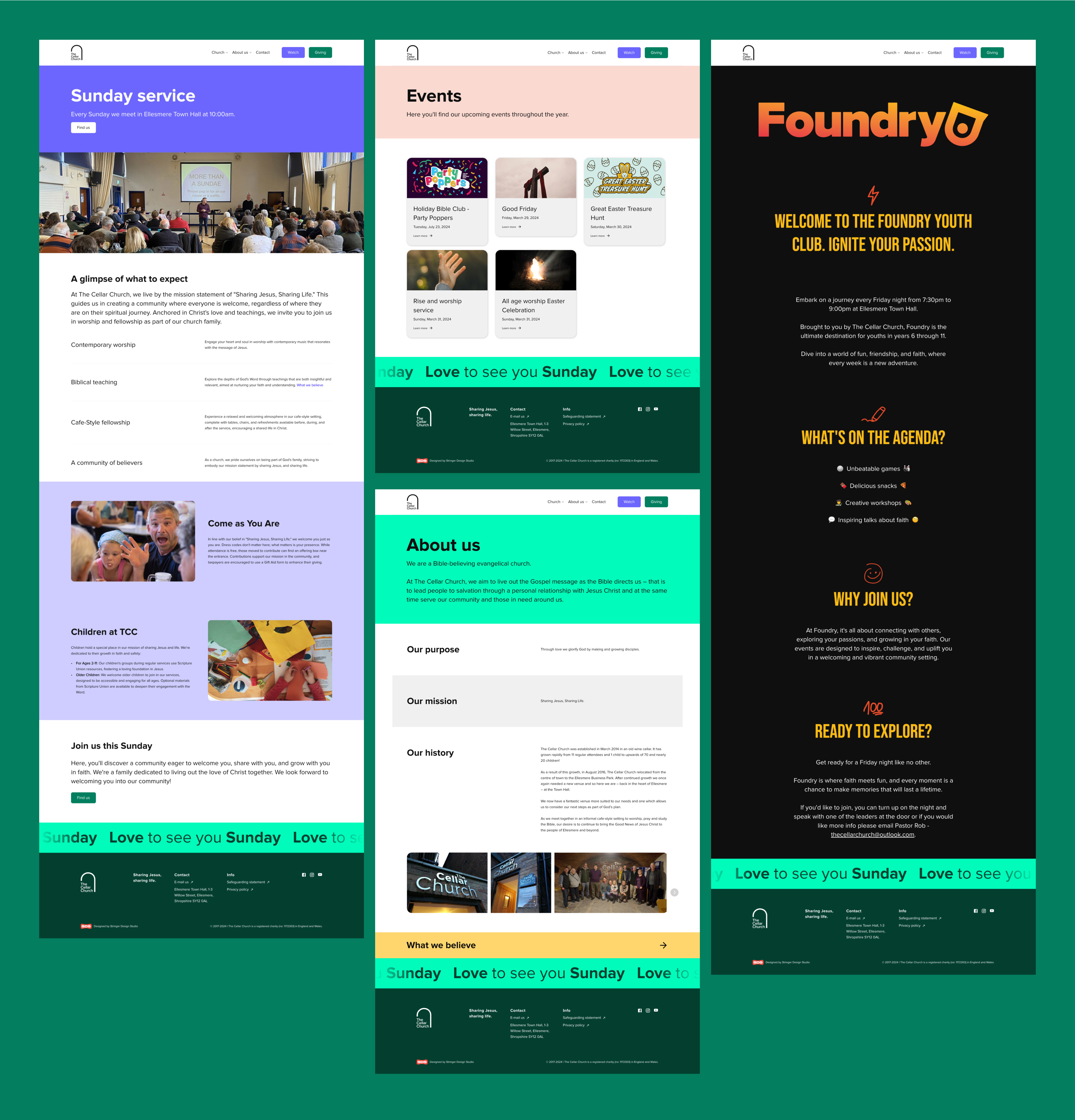
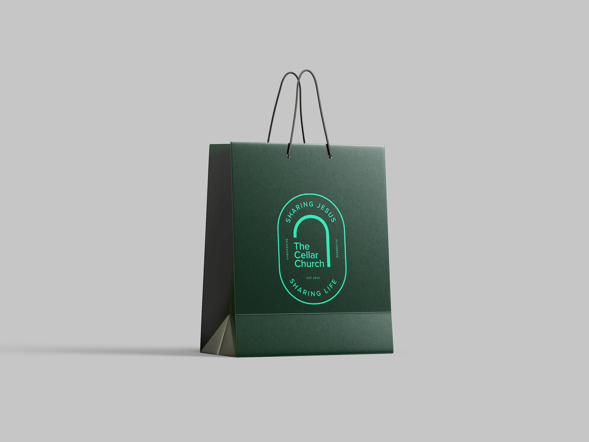
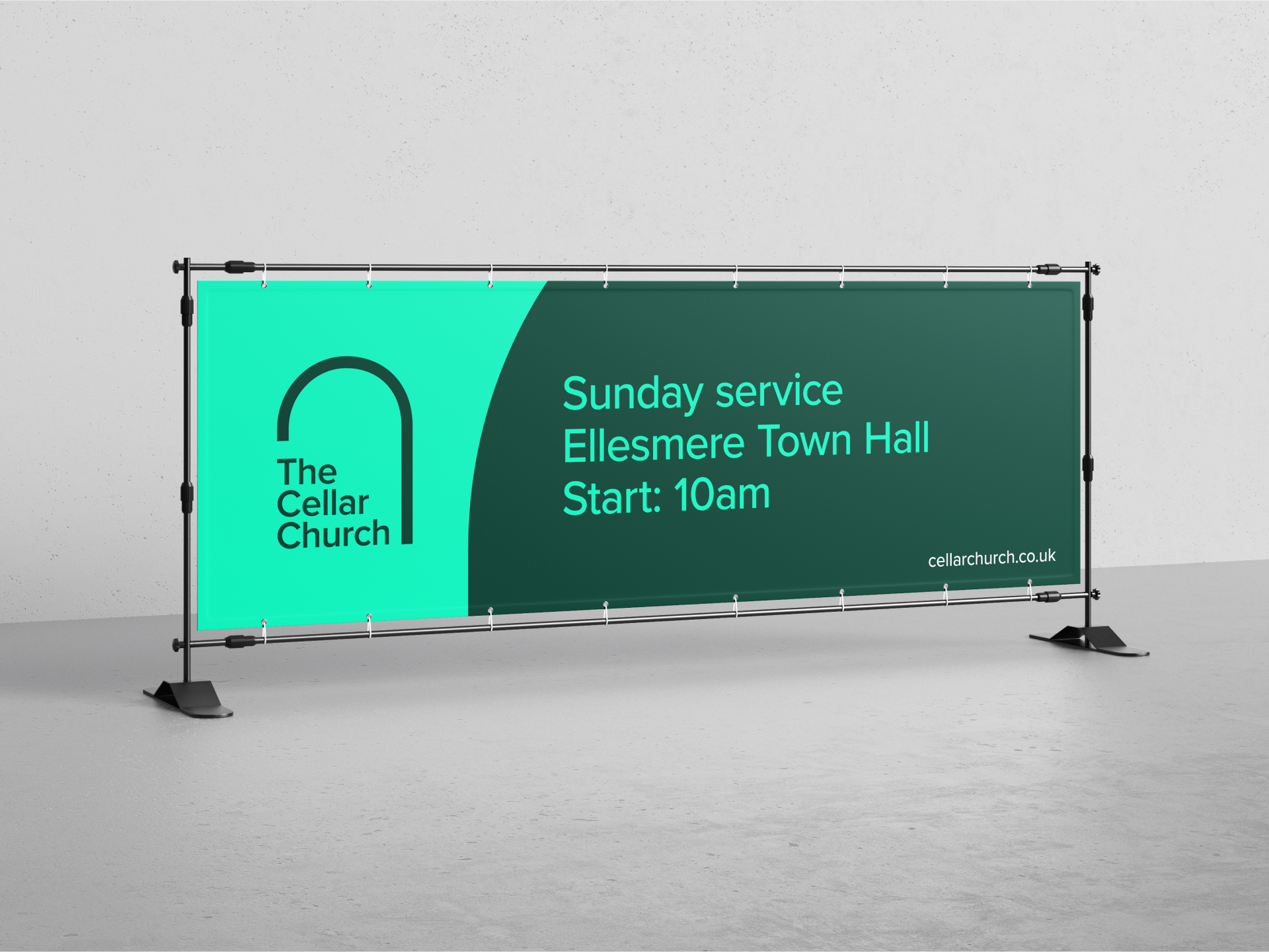
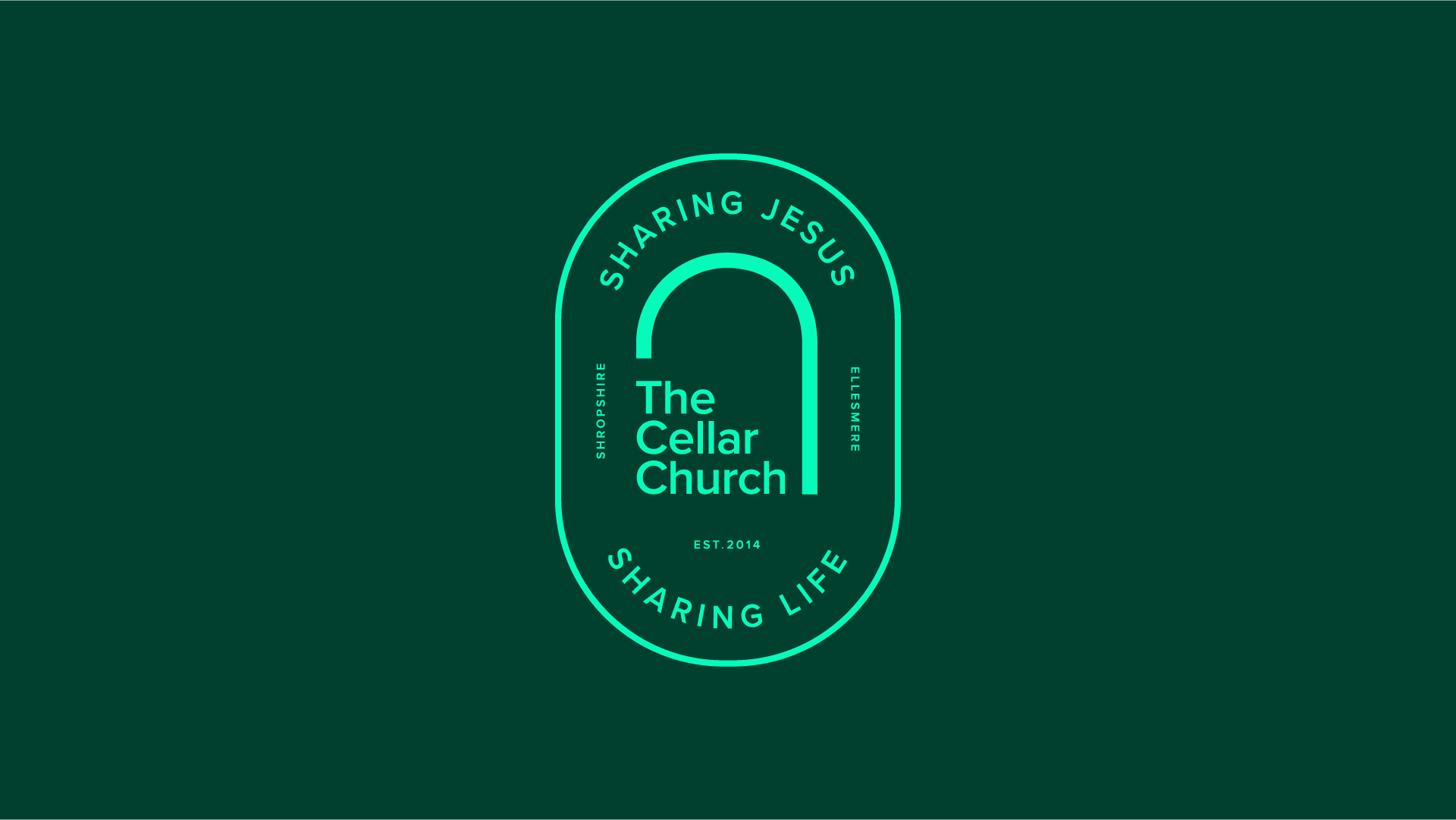
Identity Refinement: I audited the existing brand elements to identify what was working and what was creating friction. I modernised the logo into a clean, professional mark that remains legible at any size—from a favicon to a physical banner.
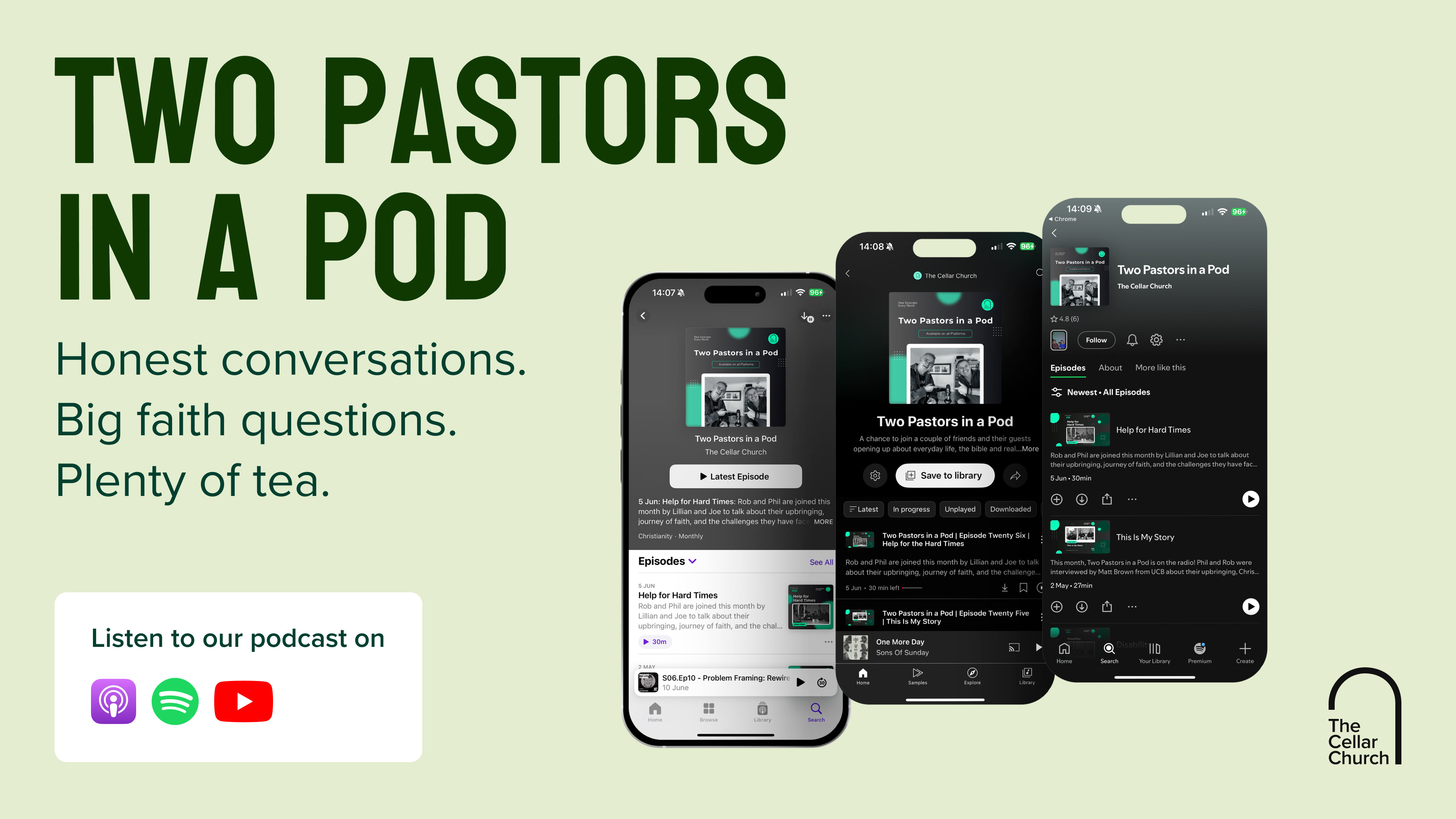
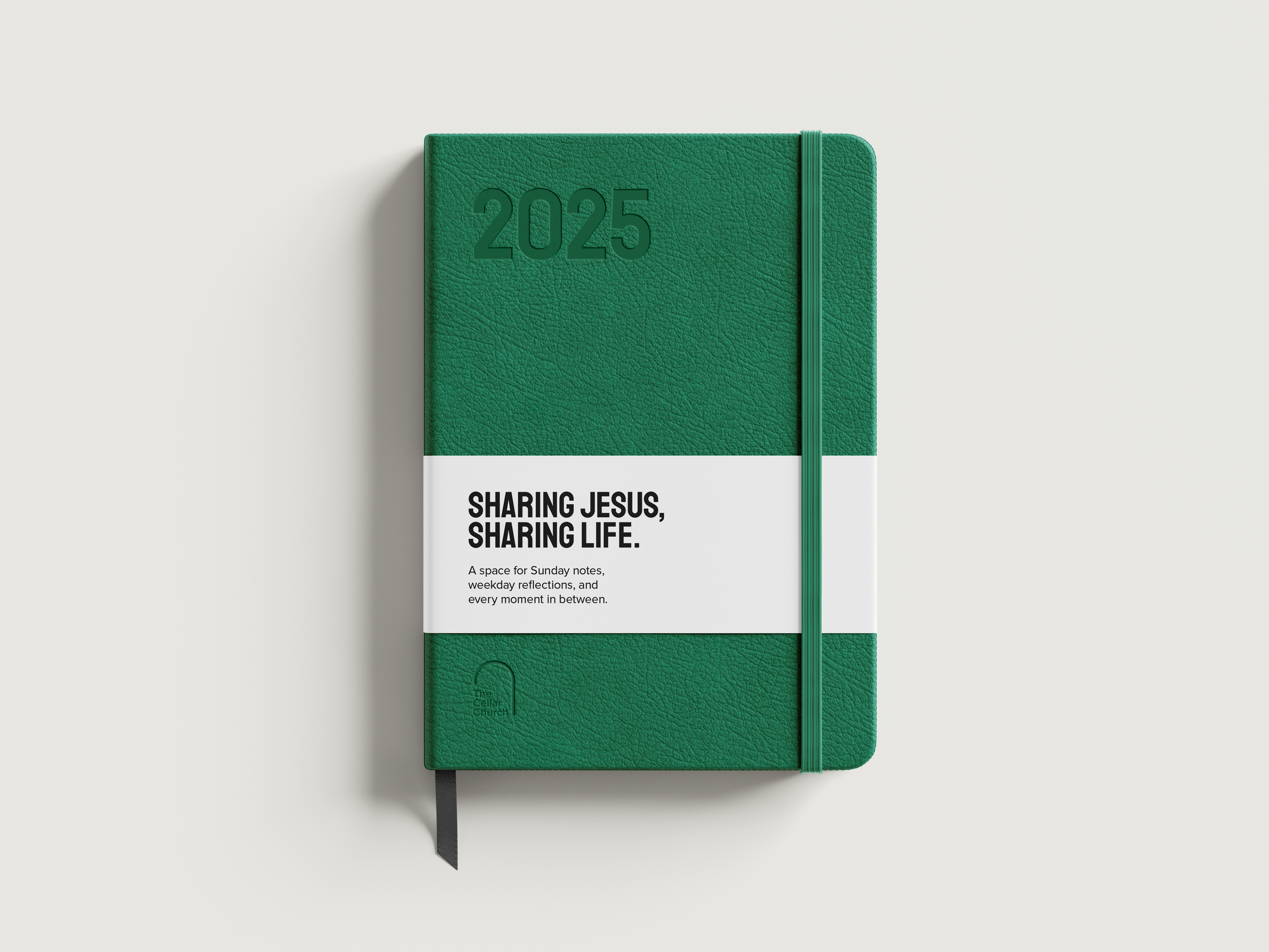
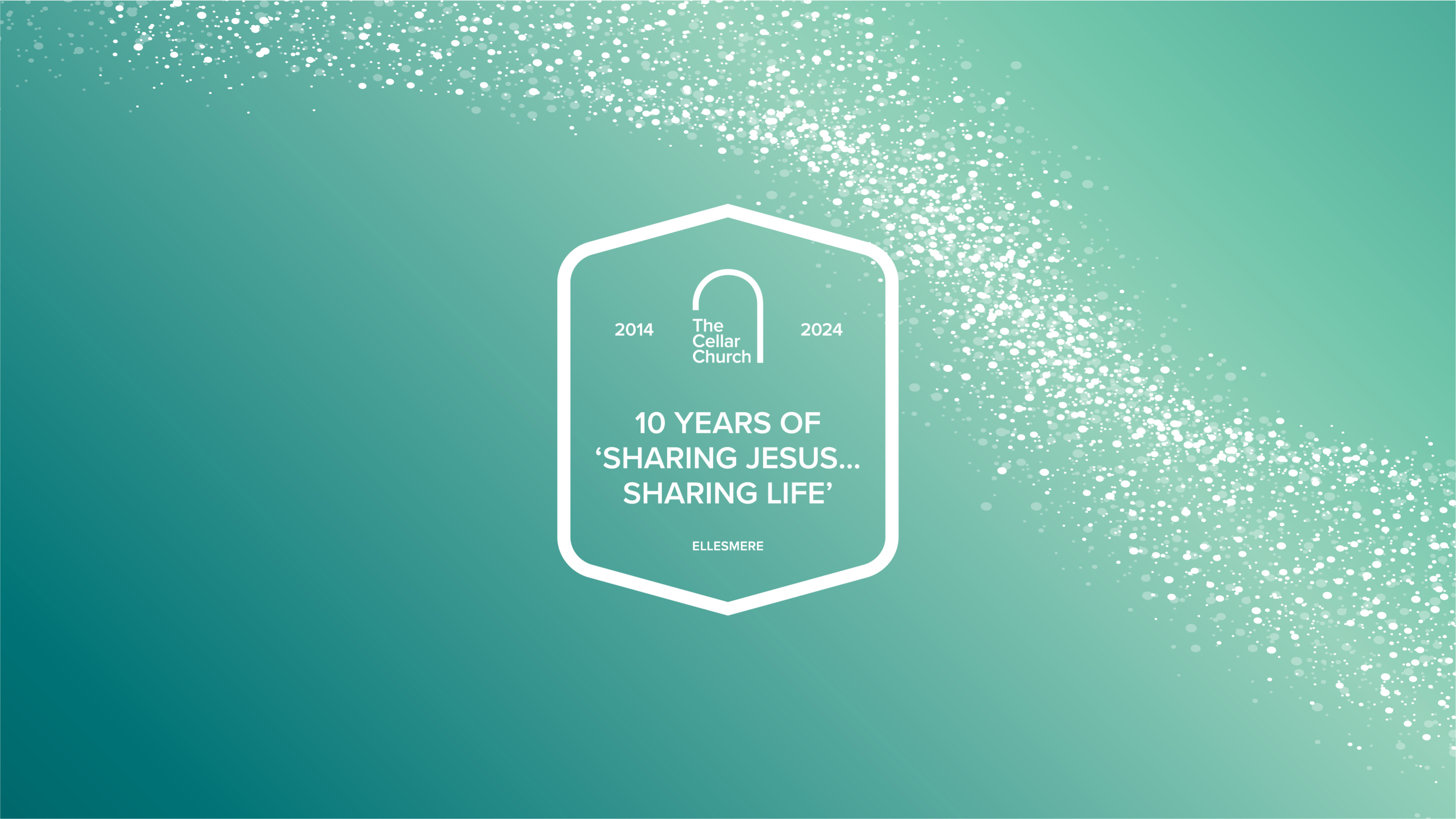
Creating Consistency: I developed a unified visual language (typography, colour palette, and graphic elements) to ensure that every touchpoint, whether a social media post or a printed flyer, felt like it belonged to the same family.
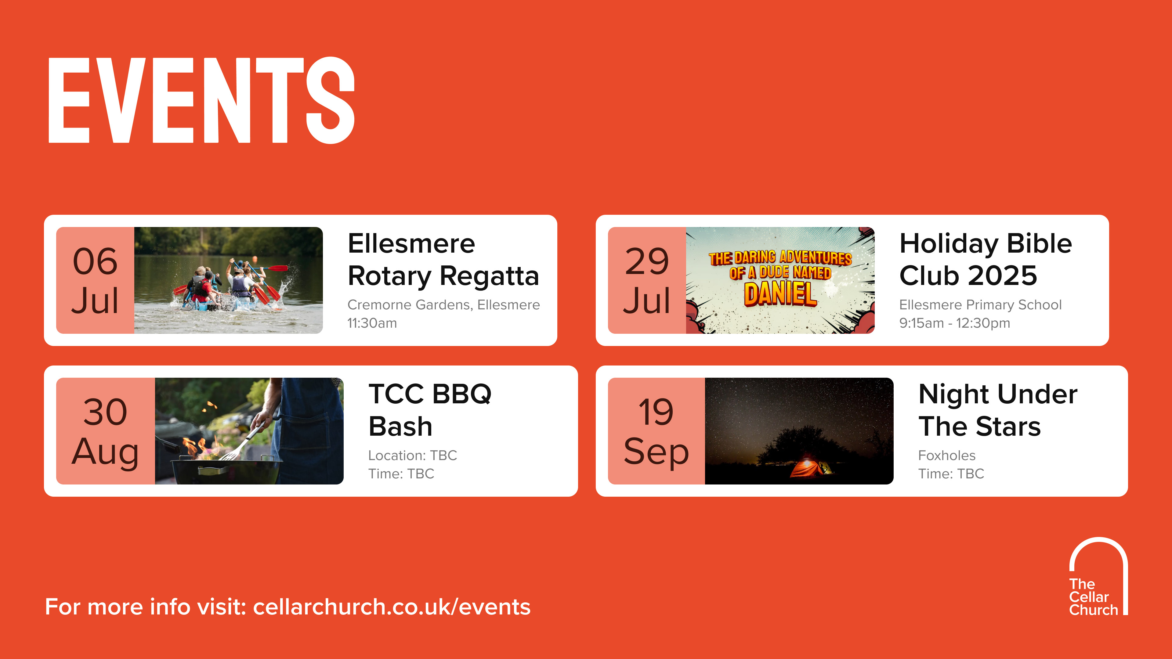
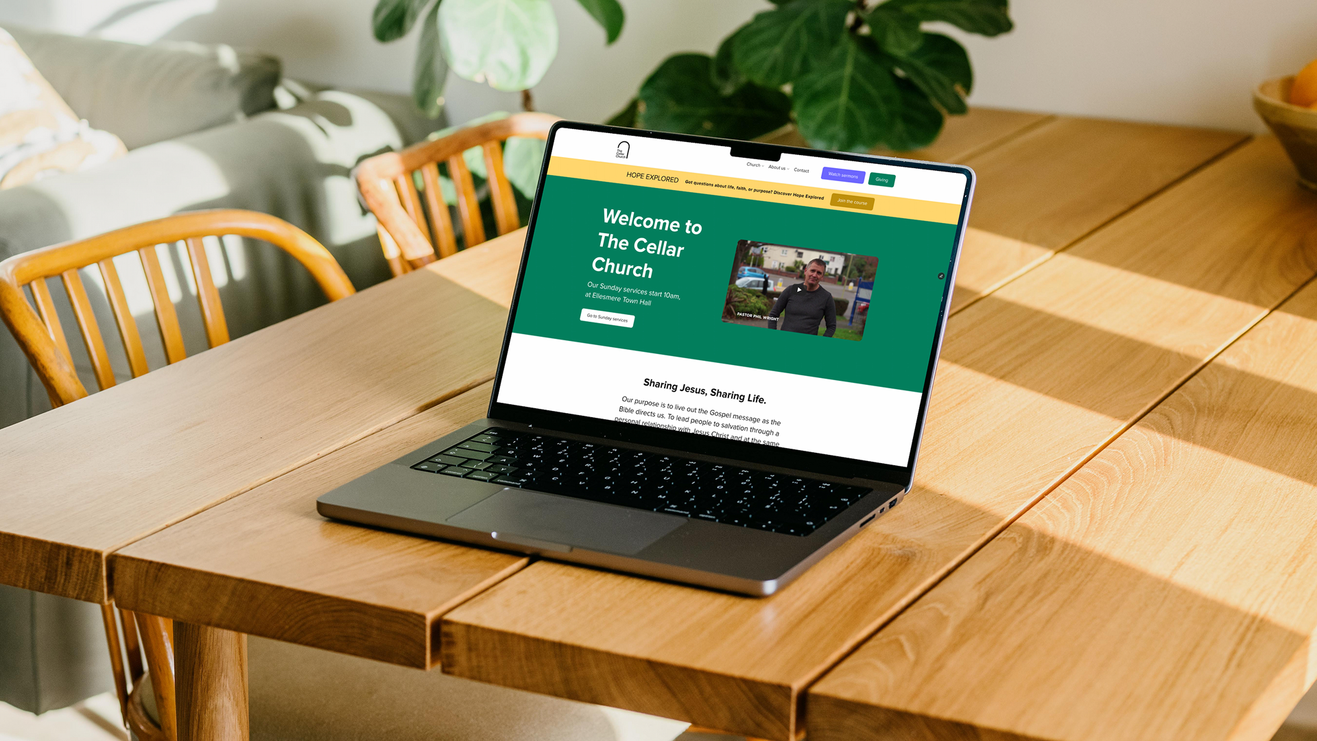
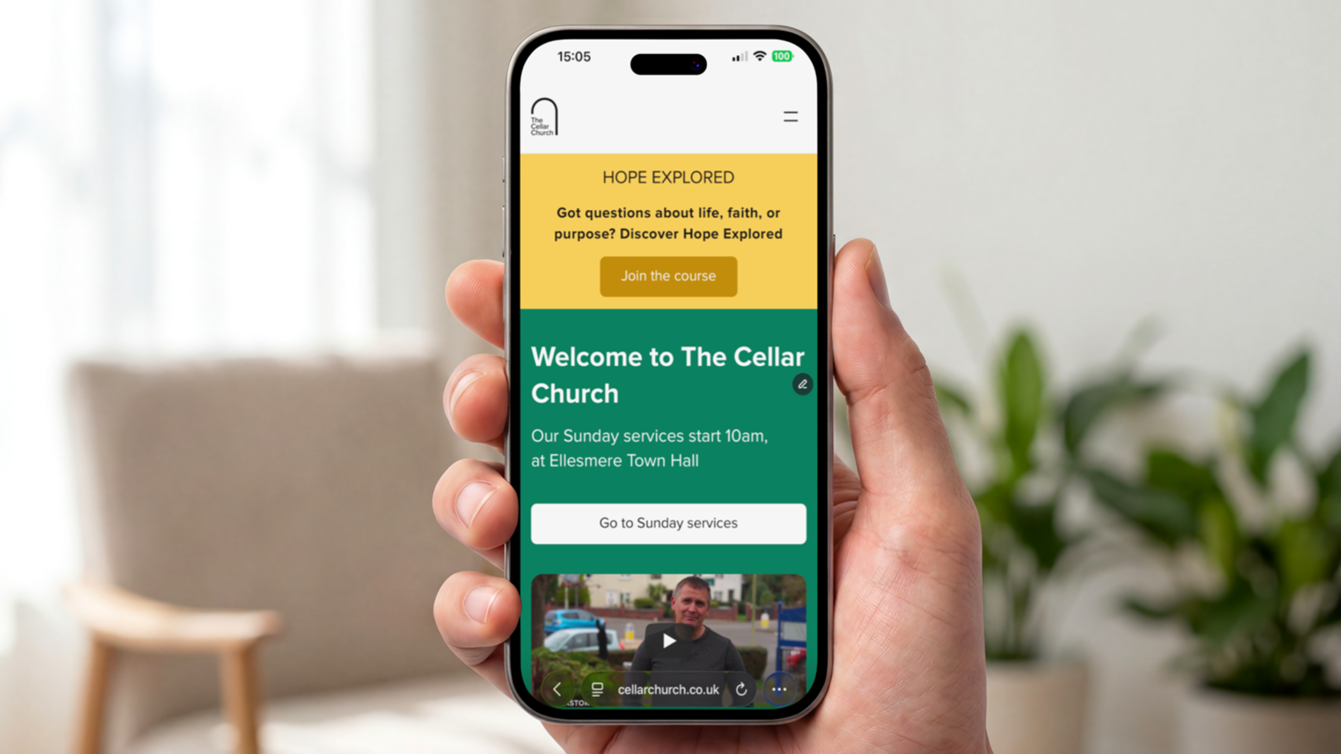
Digital-First Web Design: The website (cellarchurch.co.uk) was redesigned with a focus on User Accessibility. By streamlining the navigation and prioritising the most-searched-for info (sermons and events), we created a frictionless experience for both regulars and first-time visitors.
The Impact
The strategic shift has been a resounding success. Since the launch, The Cellar Church has seen a measurable increase in engagement from young families, successfully bridging the gap between the church’s heritage and its future. The result is a brand that no longer feels like a "best-kept secret," but a modern, welcoming space for the next generation.