SHARP SPARK
ELECTRICAL
The Challenge
Sharp Spark Electrical is a trade business built on precision and technical expertise, but their existing visual presence didn't reflect the premium quality of their work. To scale the business and "put himself on the map," the founder needed an identity that moved away from the typical "local handyman" aesthetic and toward a sophisticated, professional brand that could command higher-value contracts.
The Strategic Solution
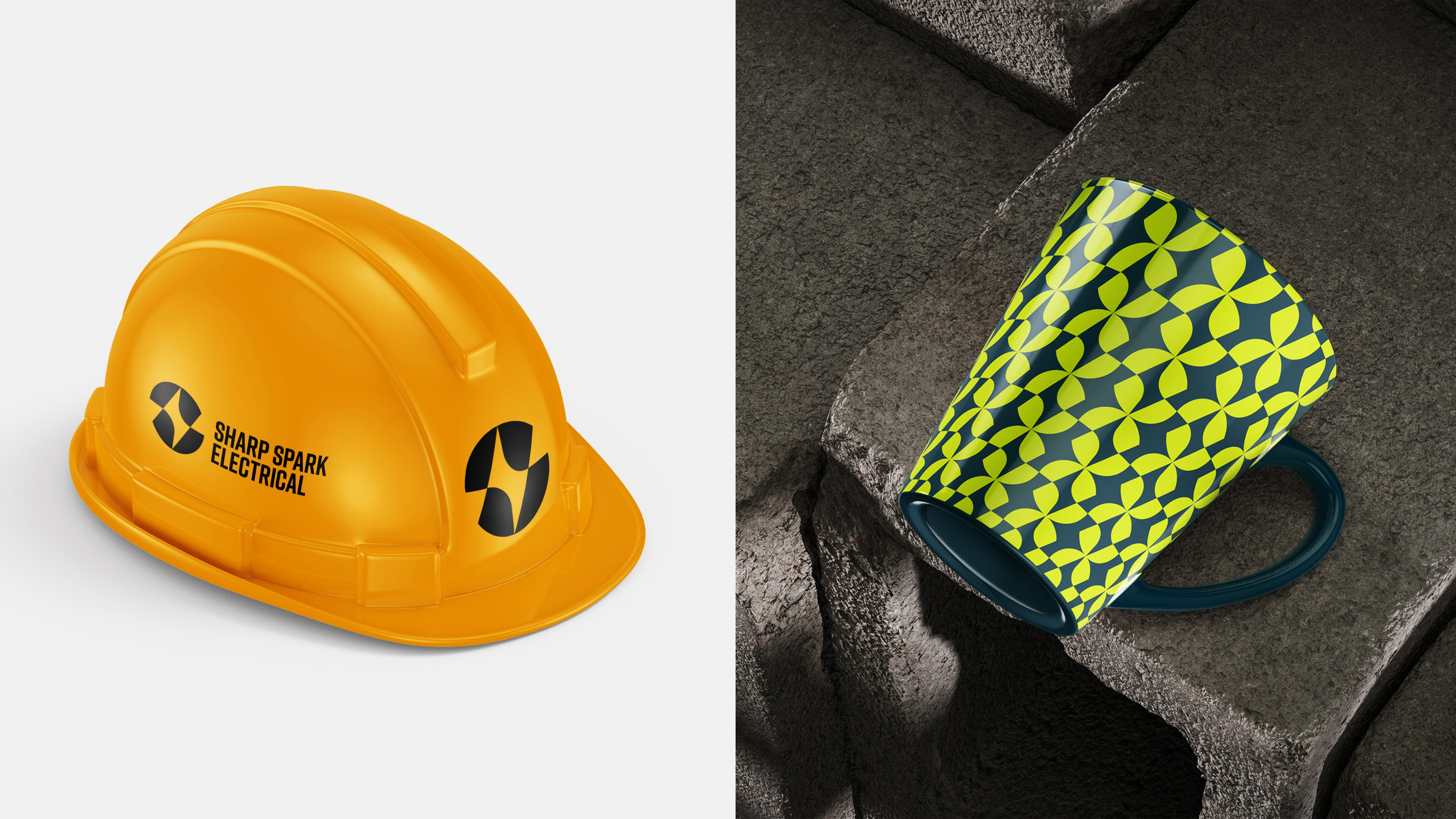
The design strategy focused on High-Contrast Professionalism. I wanted to move away from the "DIY" look common in the trades and create an identity that felt both electrically charged and technically disciplined.
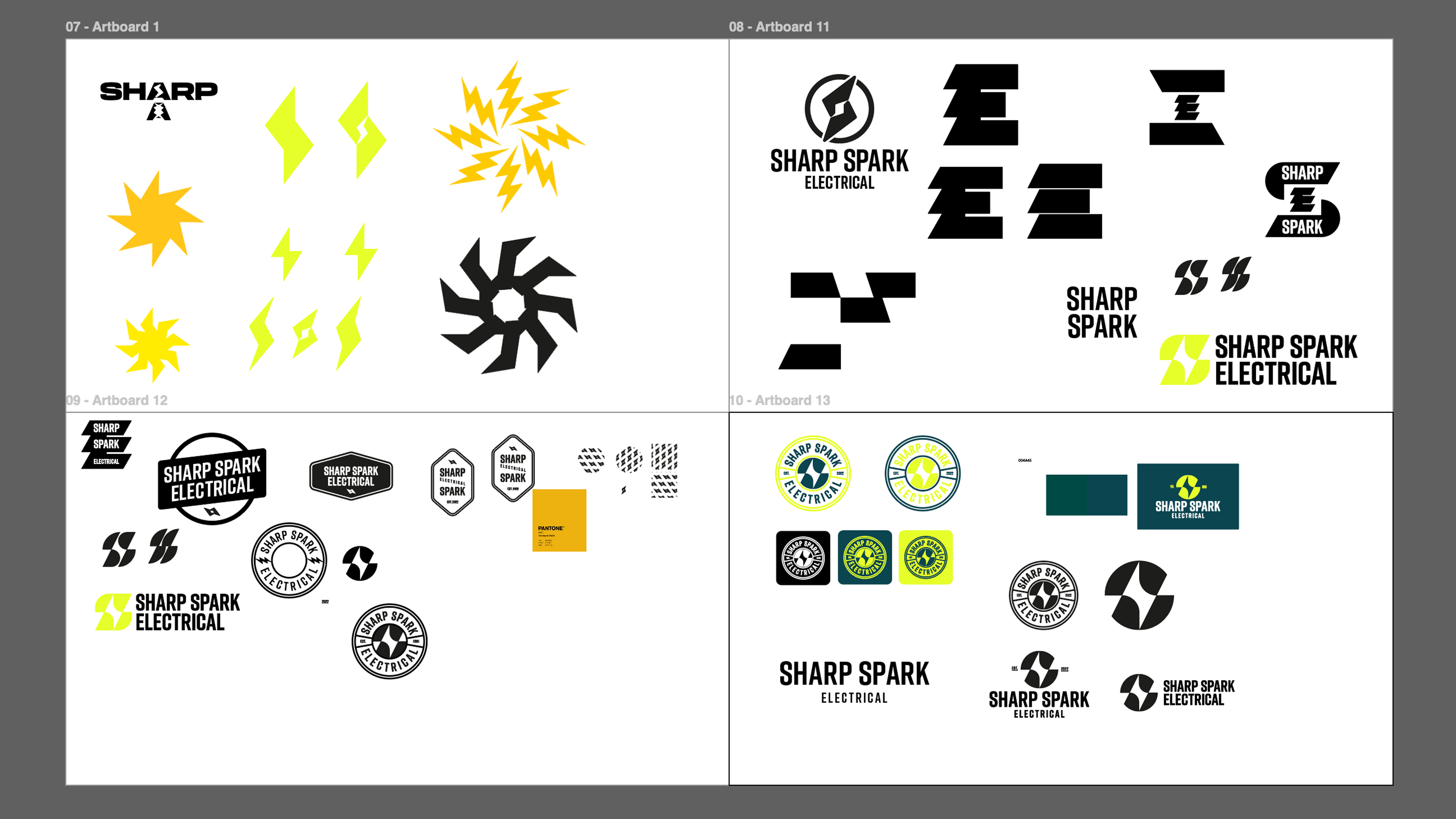
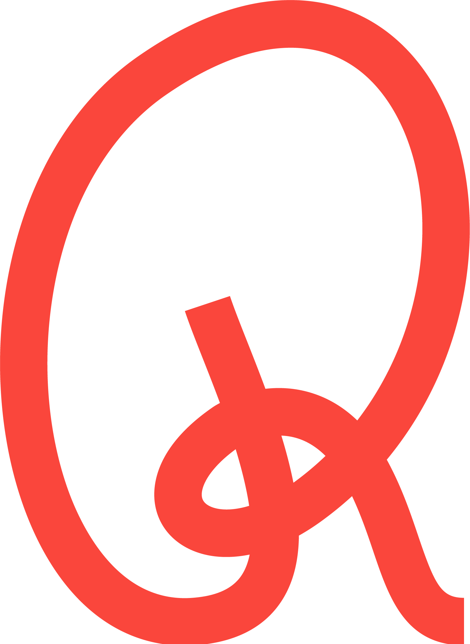
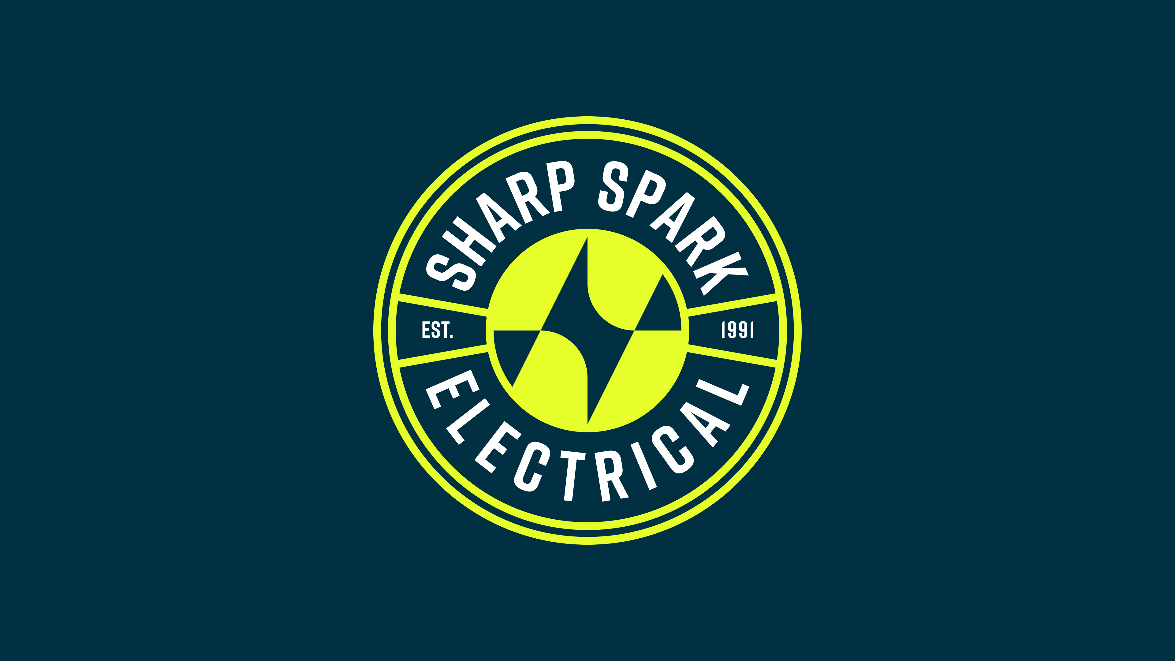
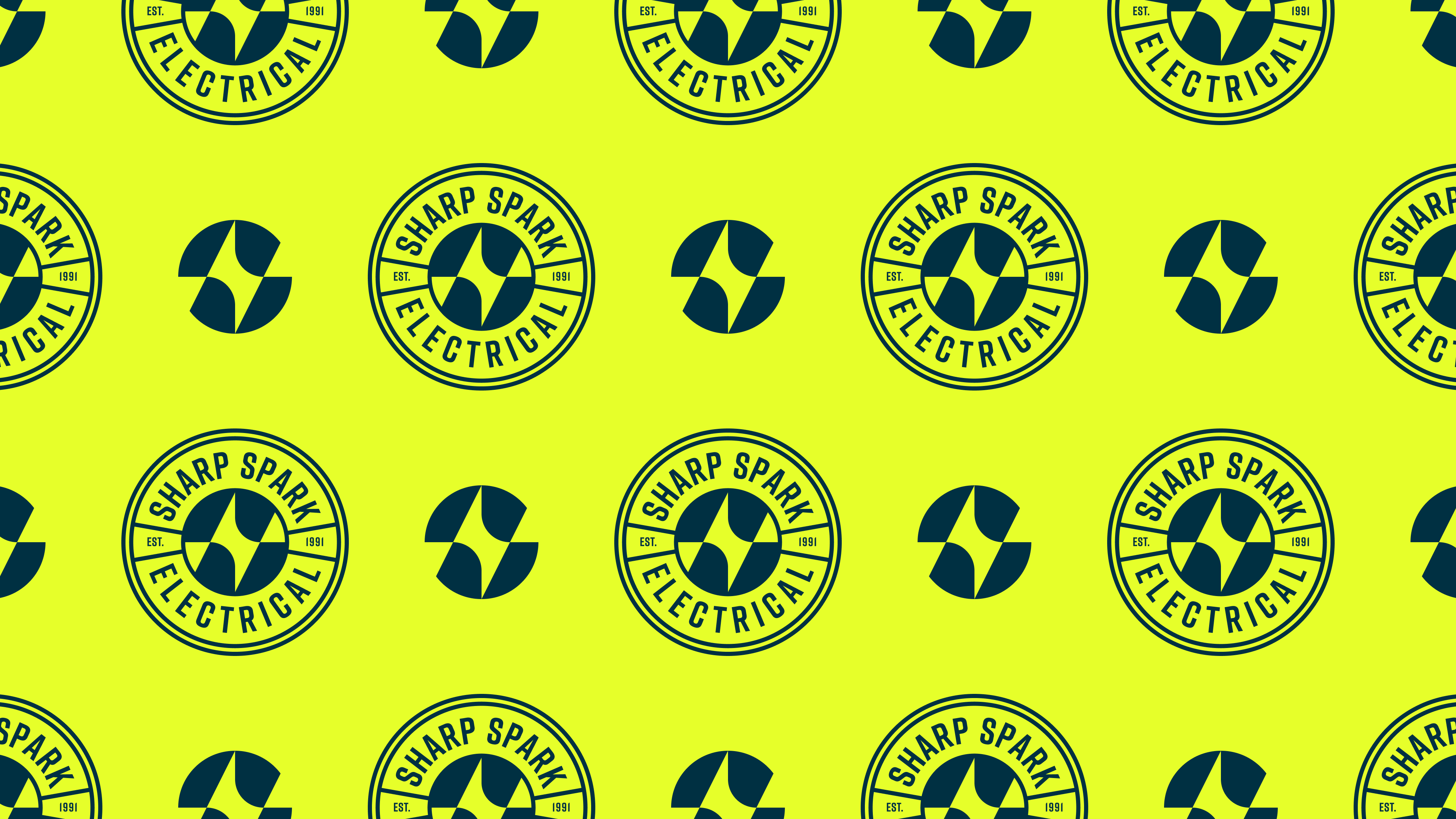
Engineering the mark: As seen in the development phase, I explored various iterations of lightning bolts and "S" forms, ultimately landing on a geometric, circular badge. This mark balances a "spark" icon with solid, architectural lines, signaling reliability and technical skill.
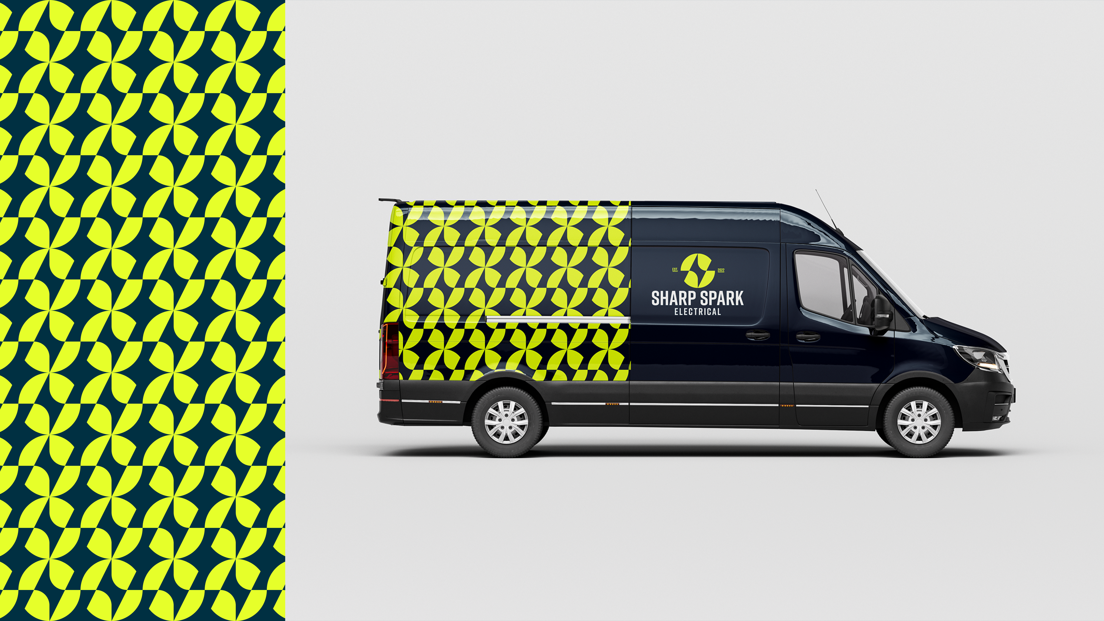
High-Impact palette: I chose a "Volt Green" paired with a deep "Midnight Navy." This high-contrast pairing ensures maximum visibility on job sites and vehicle wraps while maintaining a premium, modern feel that stands out from the sea of standard blue-and-red trade logos.
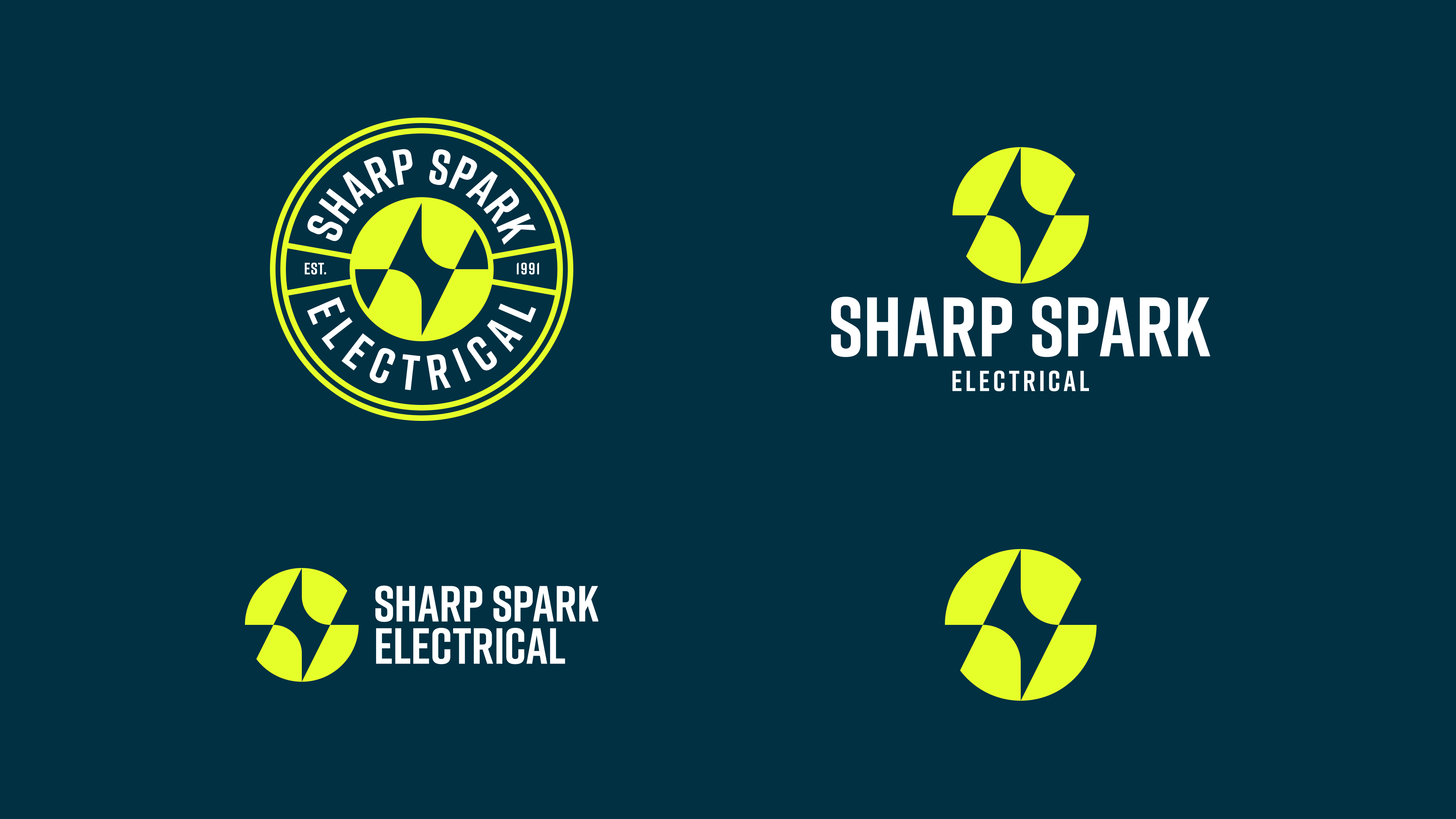
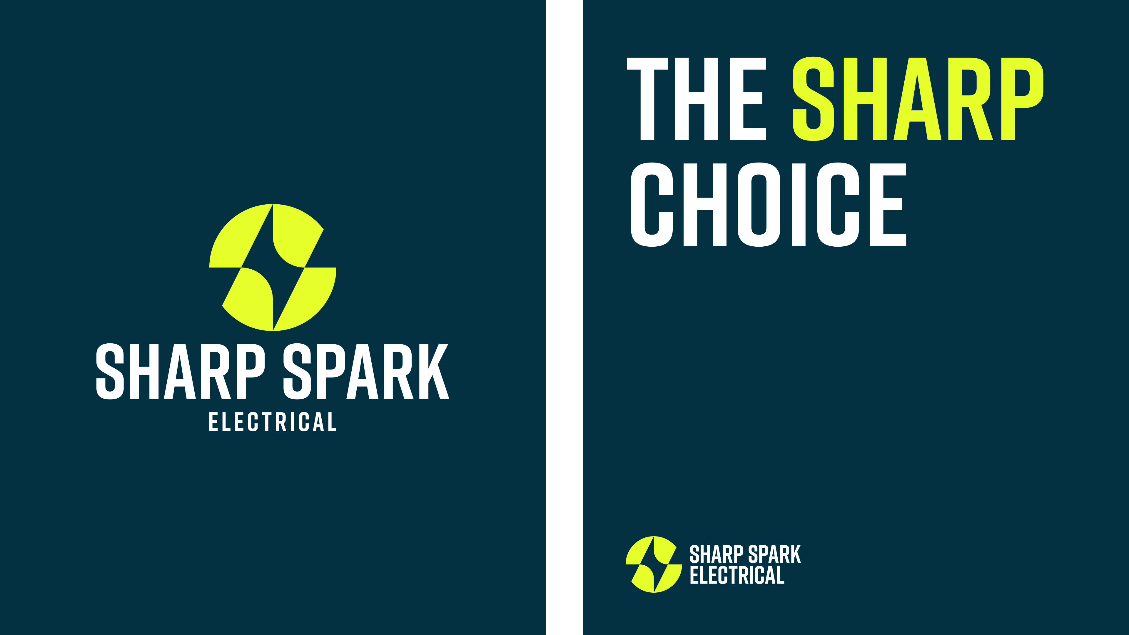
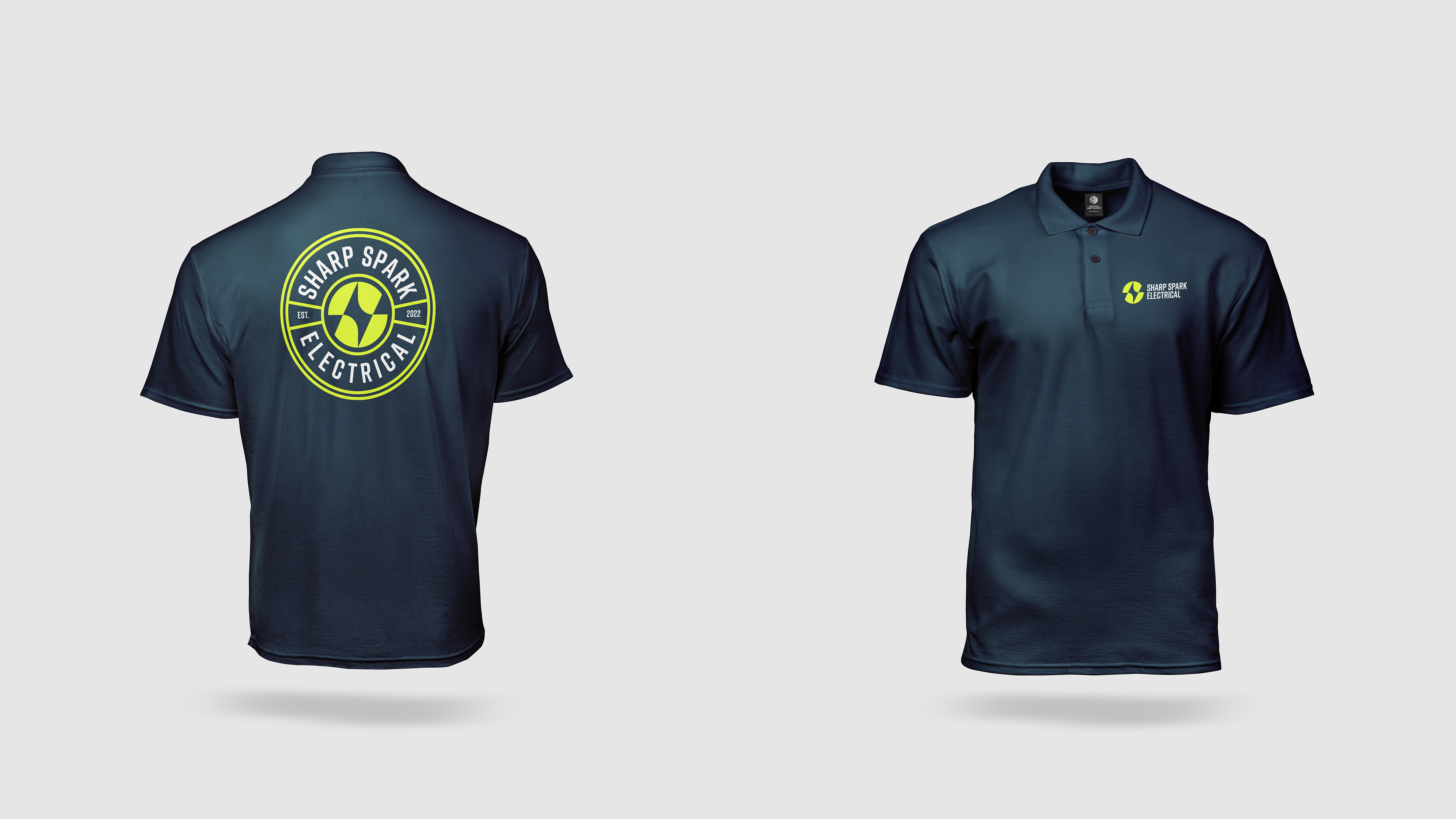
A scalable system: The identity was designed to be modular. From a bold circular badge for work apparel to a streamlined horizontal lockup for digital platforms and a repeating geometric pattern for high-impact vehicle livery.
The Impact
The result is a comprehensive brand system that finally matches the high-calibre work Sharp Spark delivers. By moving away from a "local tradesman" look to a sophisticated, digital-ready identity, the business now projects the authority and precision of a high-end firm.
The brand has been equipped with a professional "Sharp Choice" toolkit, from high-visibility vehicle livery to premium apparel, ensuring that every physical and digital touchpoint now works to build trust and command attention on the map.
A look at the process: testing different ways to mix a 'spark' with a clean, solid shape to find a logo that feels both modern and professional.