CWT Global Brand Refresh
The Challenge
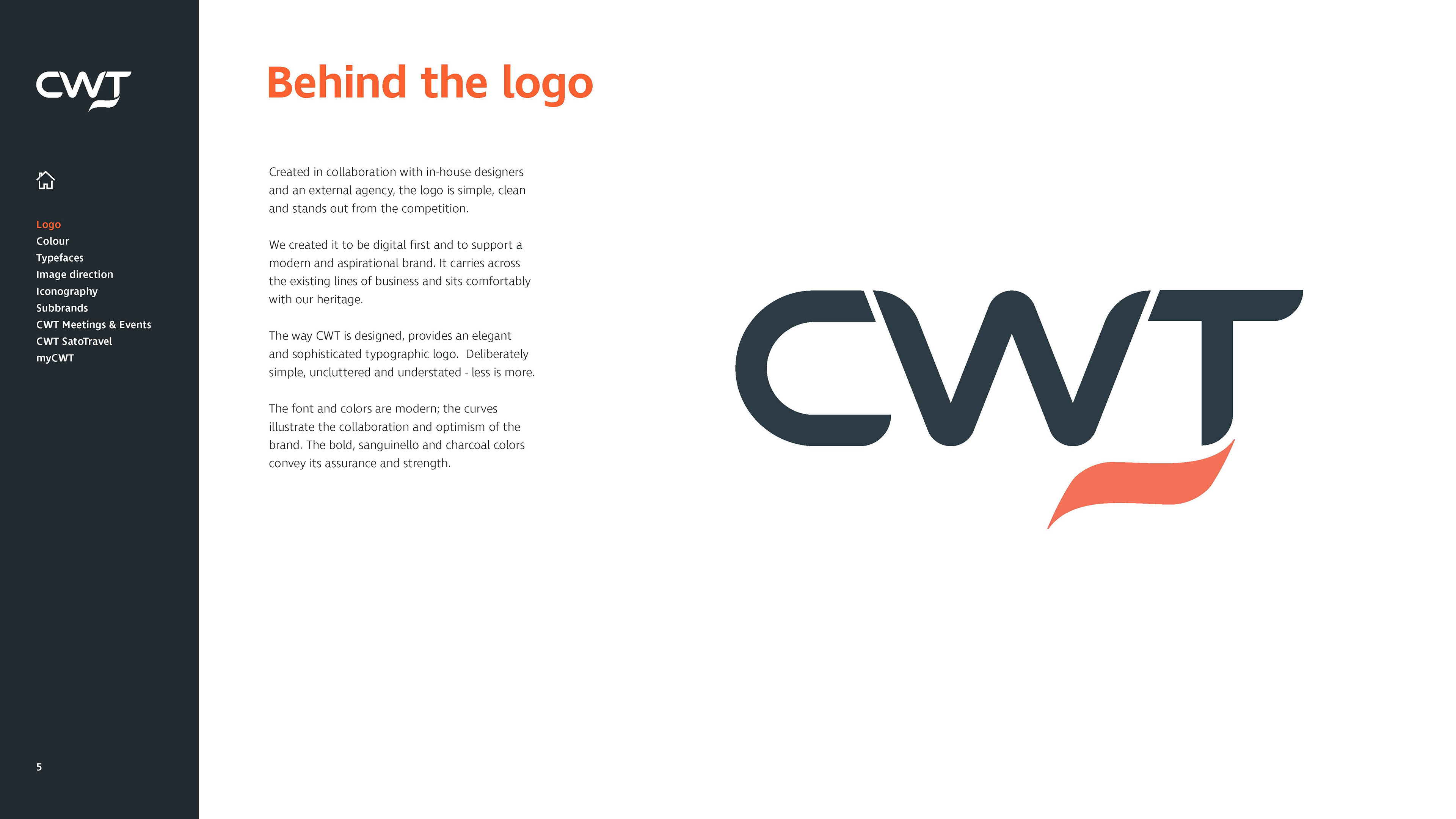
CWT, a global leader in business travel and meetings management, required a modern visual refresh of its brand identity to ensure consistency, digital accessibility, and contemporary appeal across all international markets. The core challenge was modernising the brand architecture and bringing it up to modern digital standards without losing established brand equity—specifically the iconic CWT logo and signature orange primary palette.
The Strategic Solution
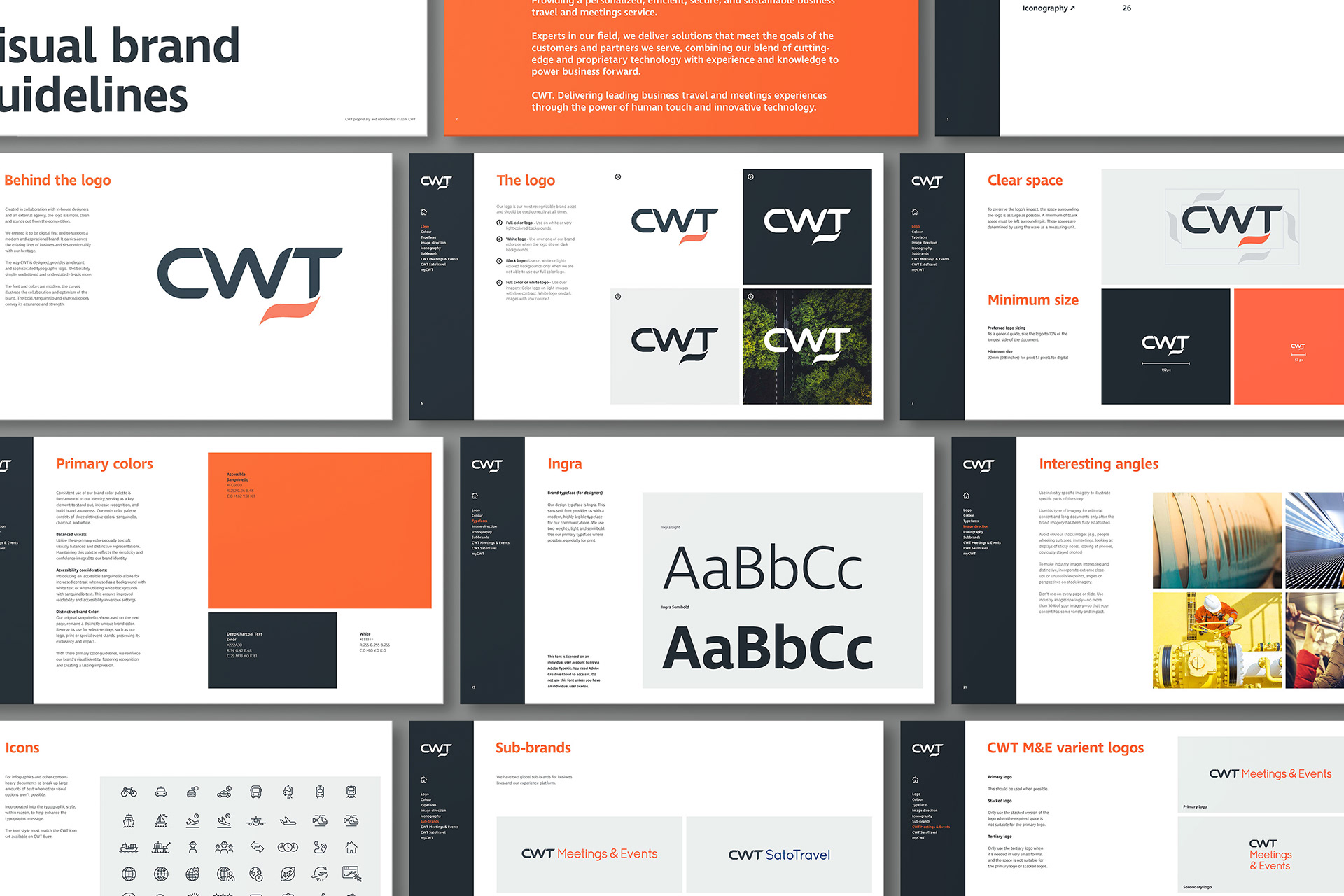
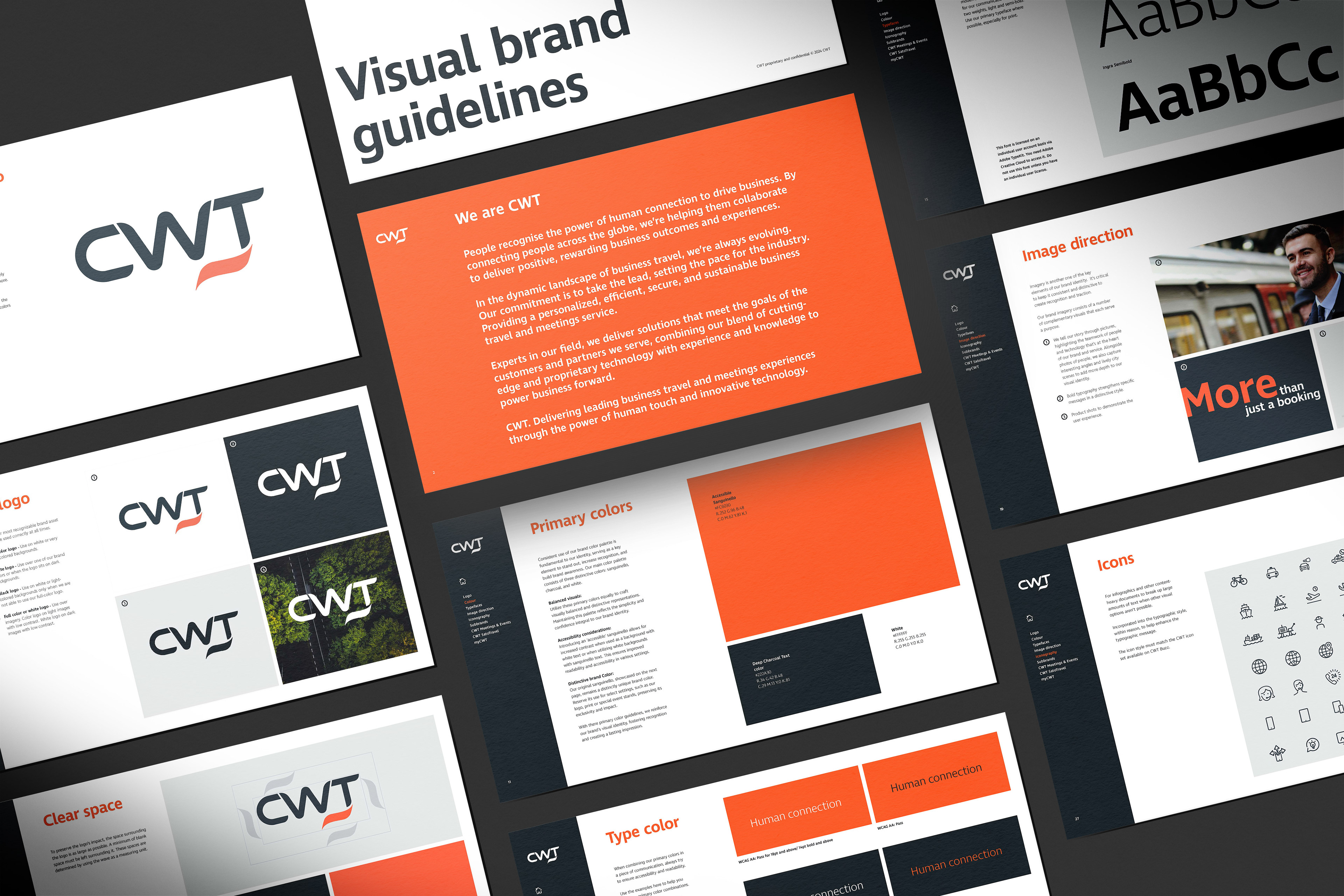
I led the visual identity evolution, establishing a modern design system and authoring a comprehensive global brand guidelines manual built for international scale:
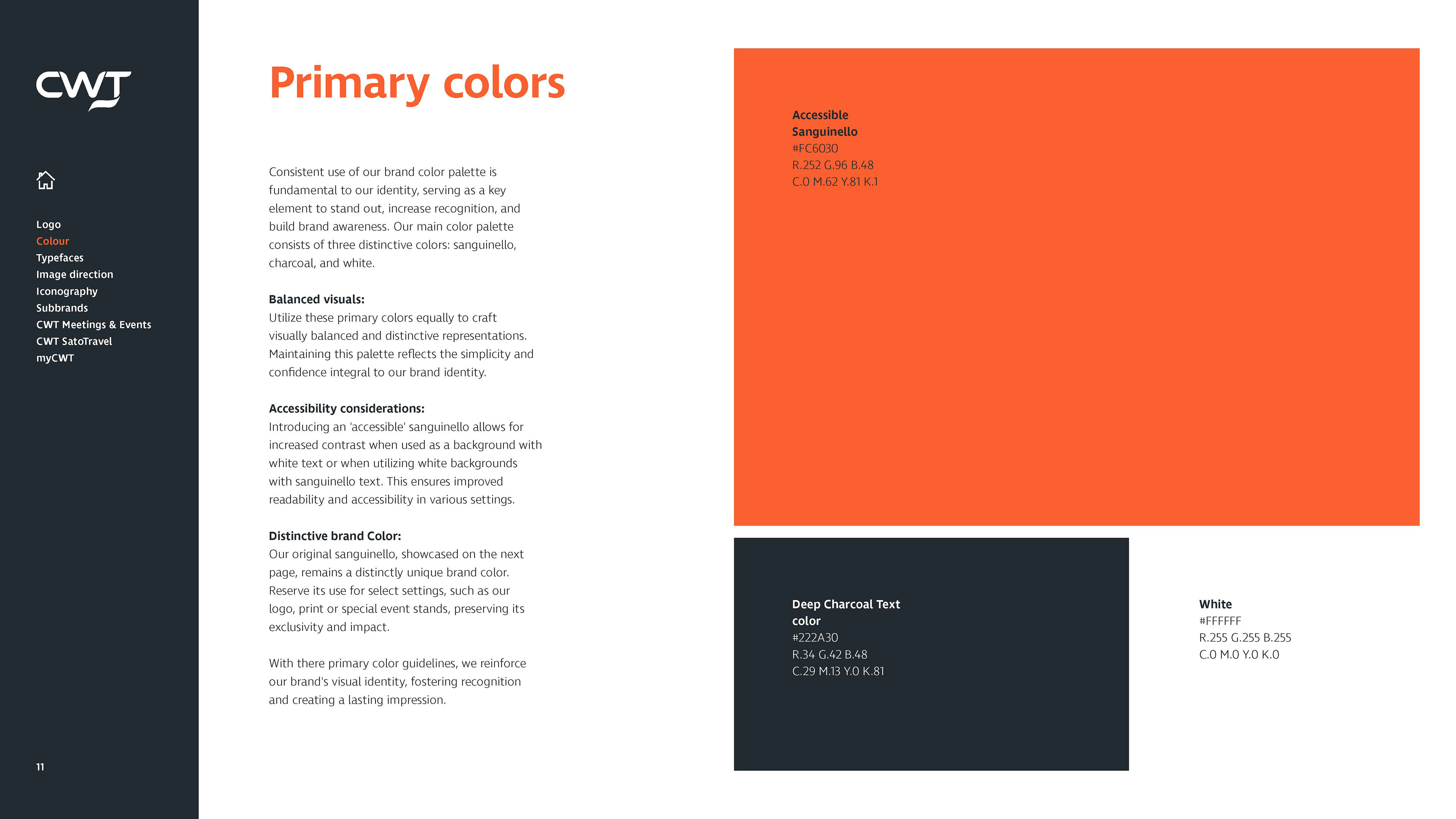
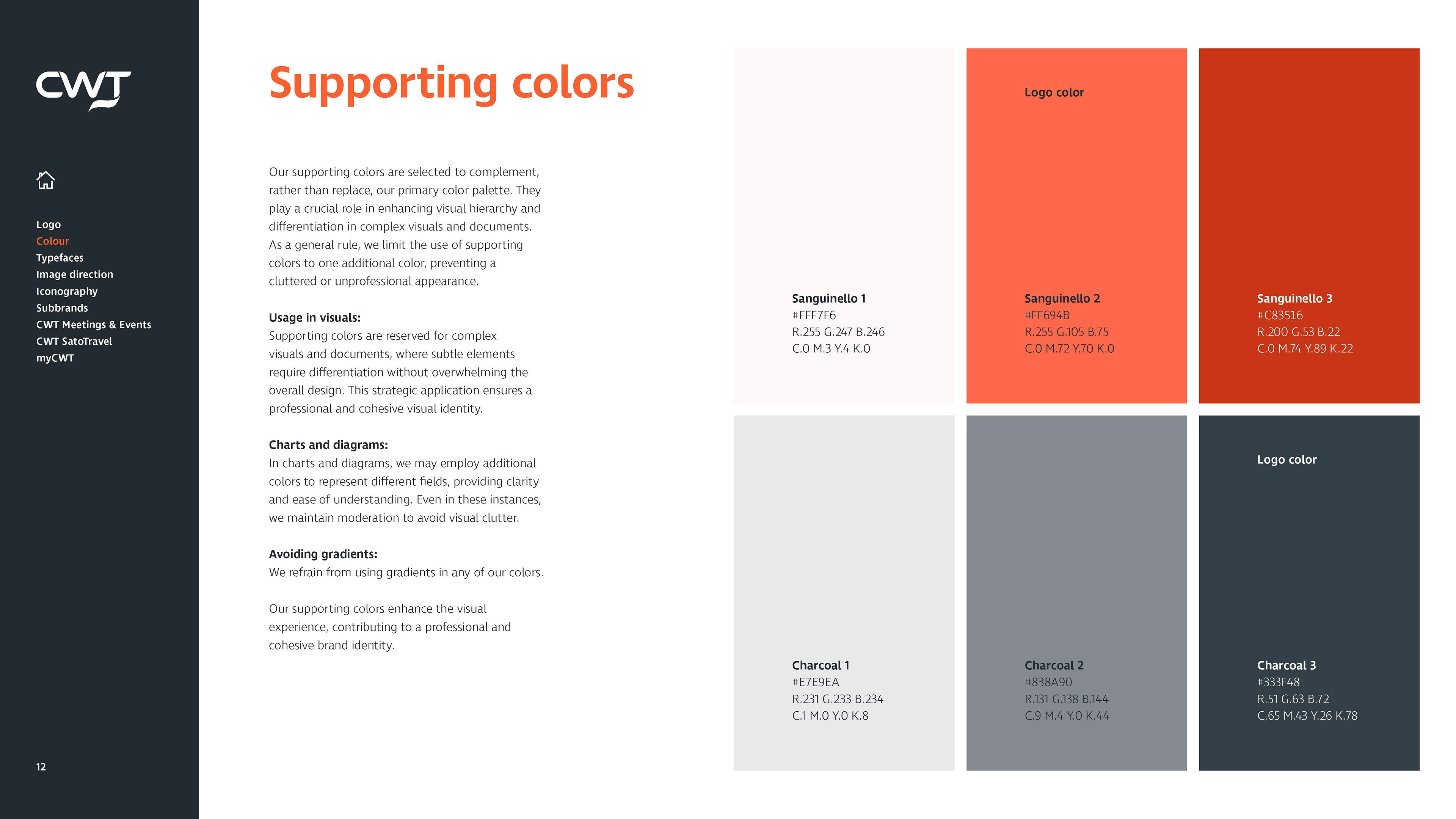
Accessibility-First Palette: Expanded the primary and secondary colour palettes with WCAG-compliant contrast options to ensure digital inclusivity across screen environments and mobile interfaces.
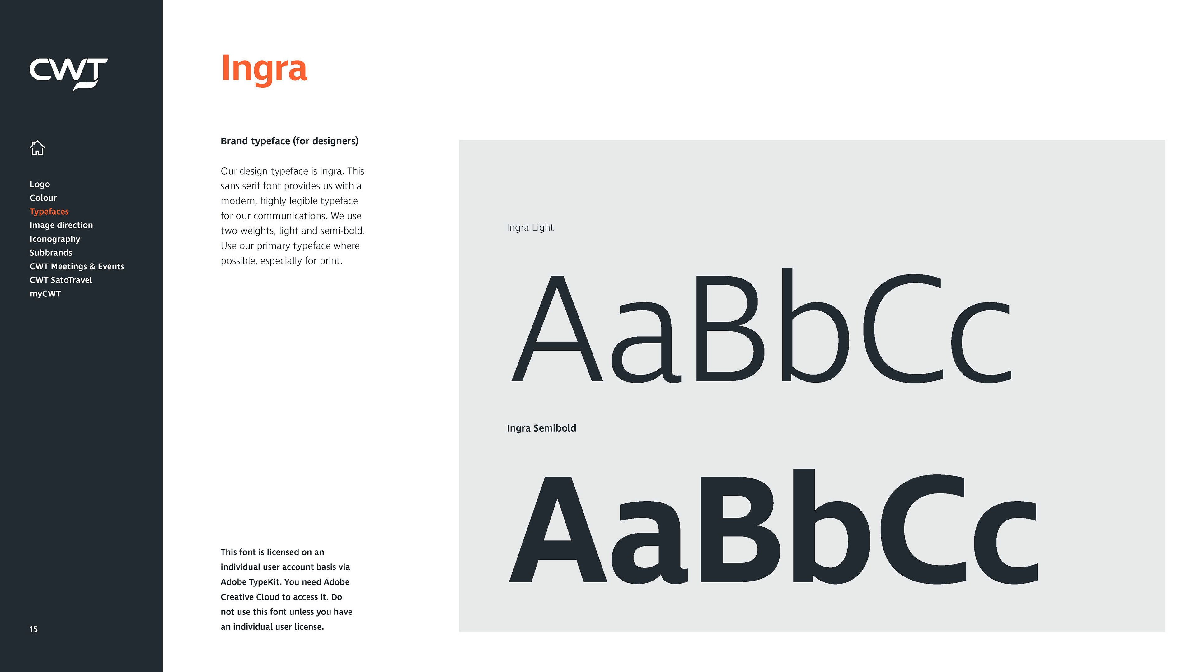
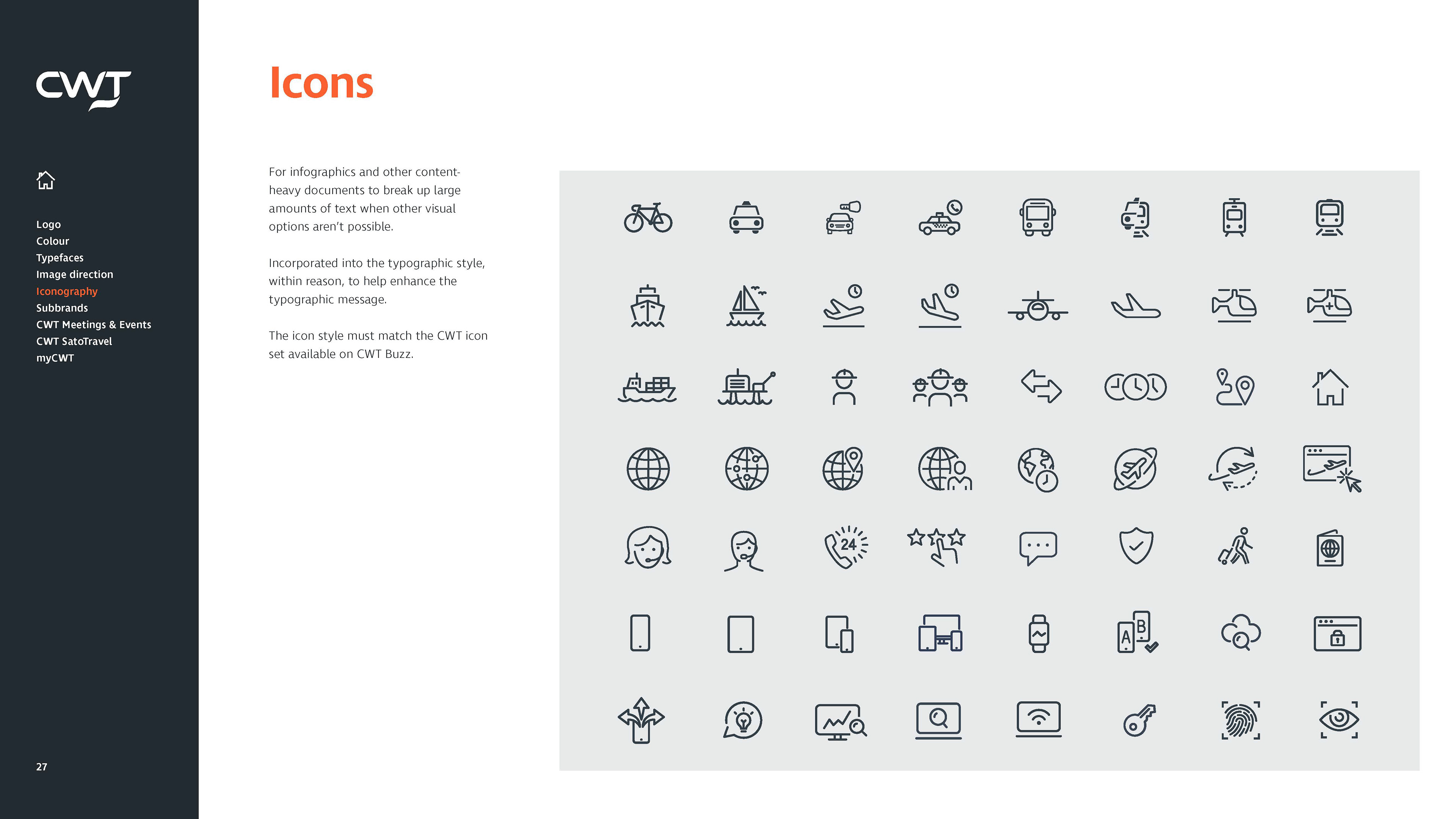
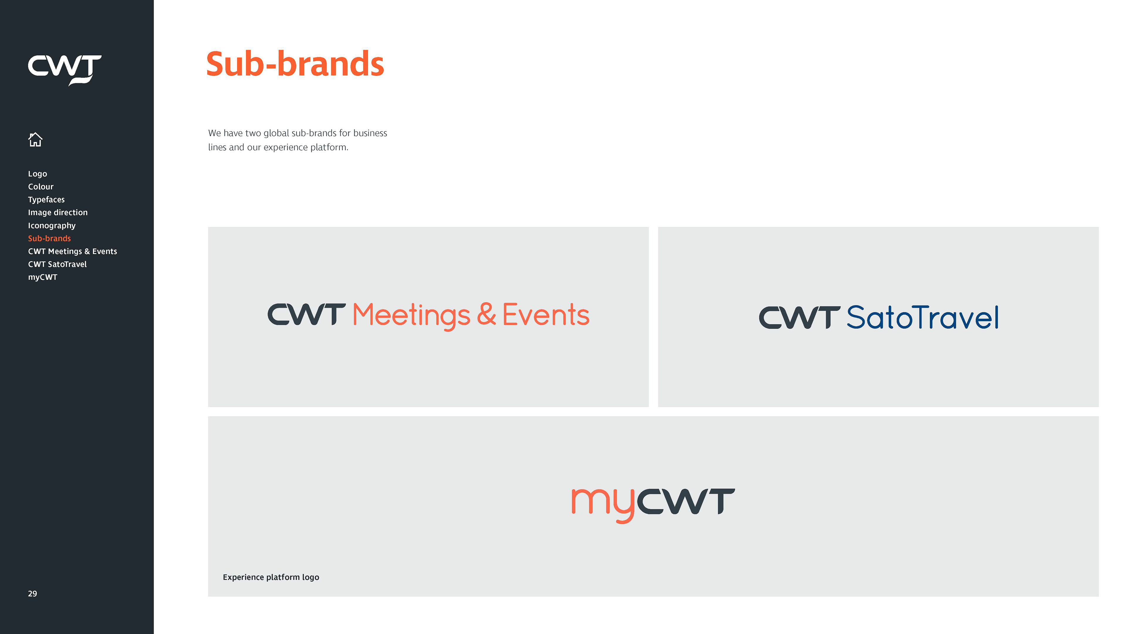
Structured Layout System: Standardised typographic hierarchies, grid frameworks, icon sets, and sub-branding rules (such as CWT Meetings & Events) to streamline communications across corporate collateral and digital products.
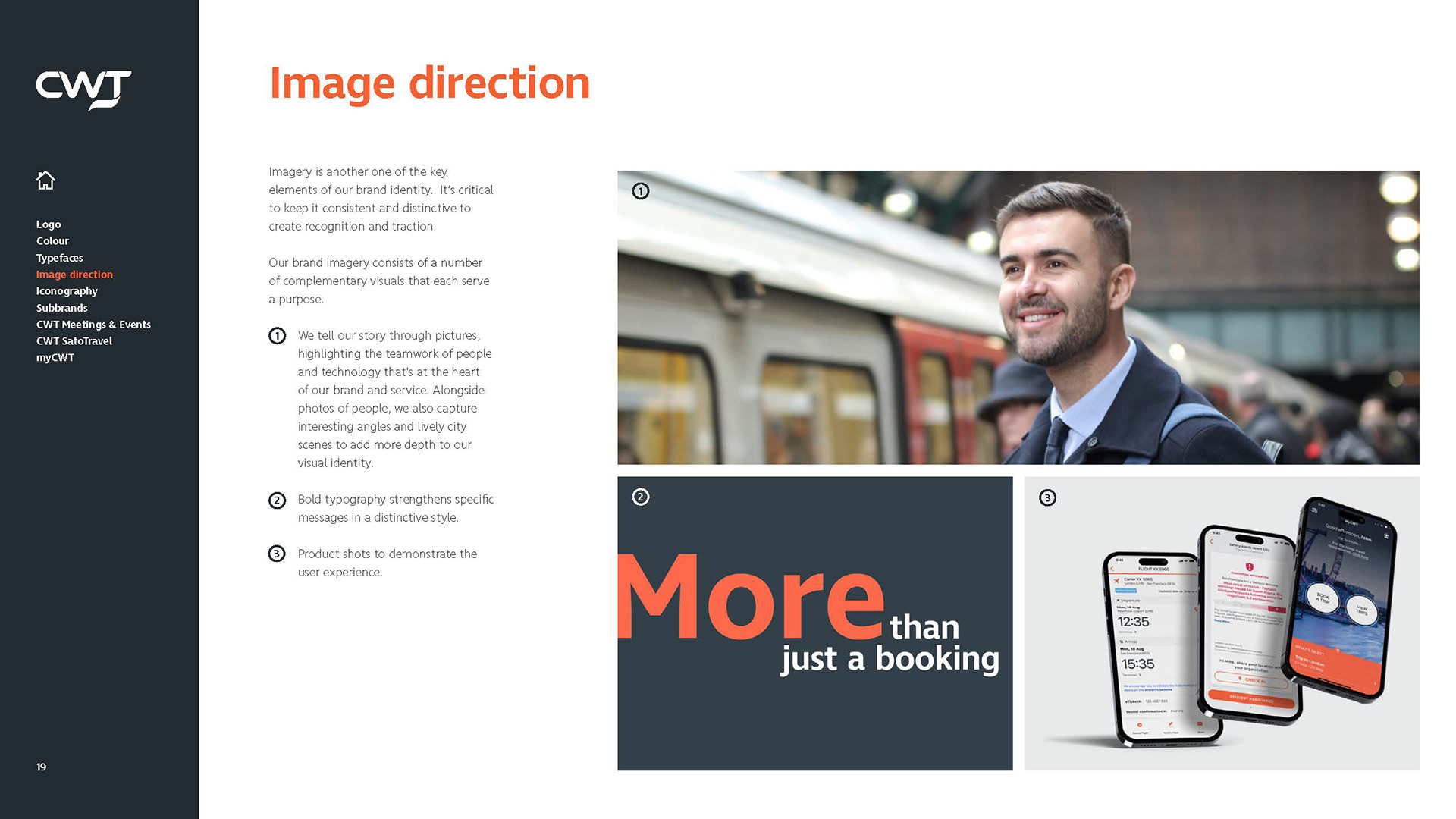
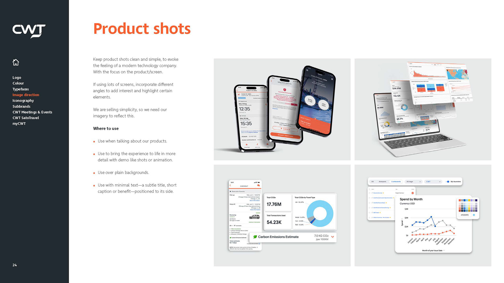
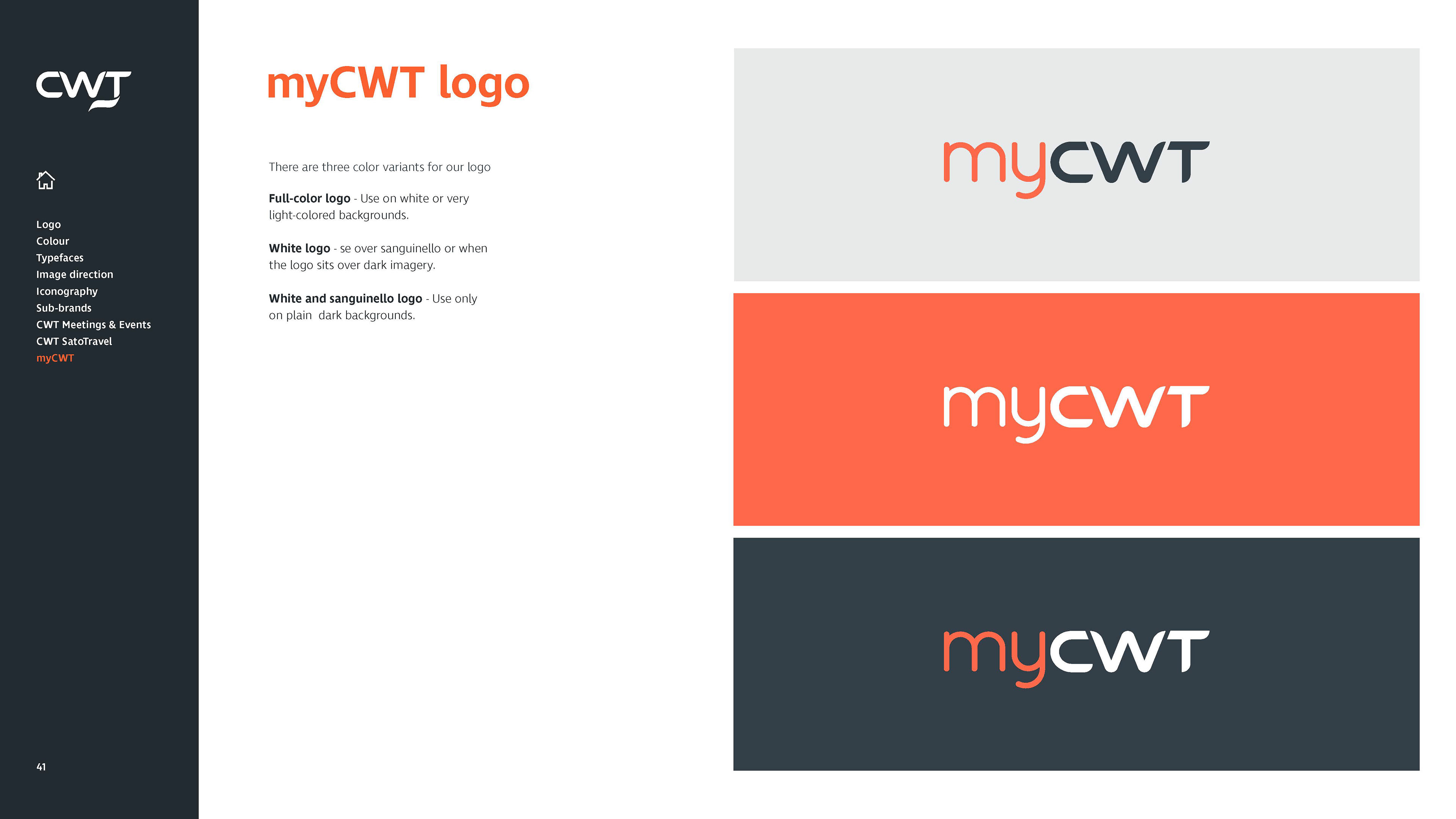
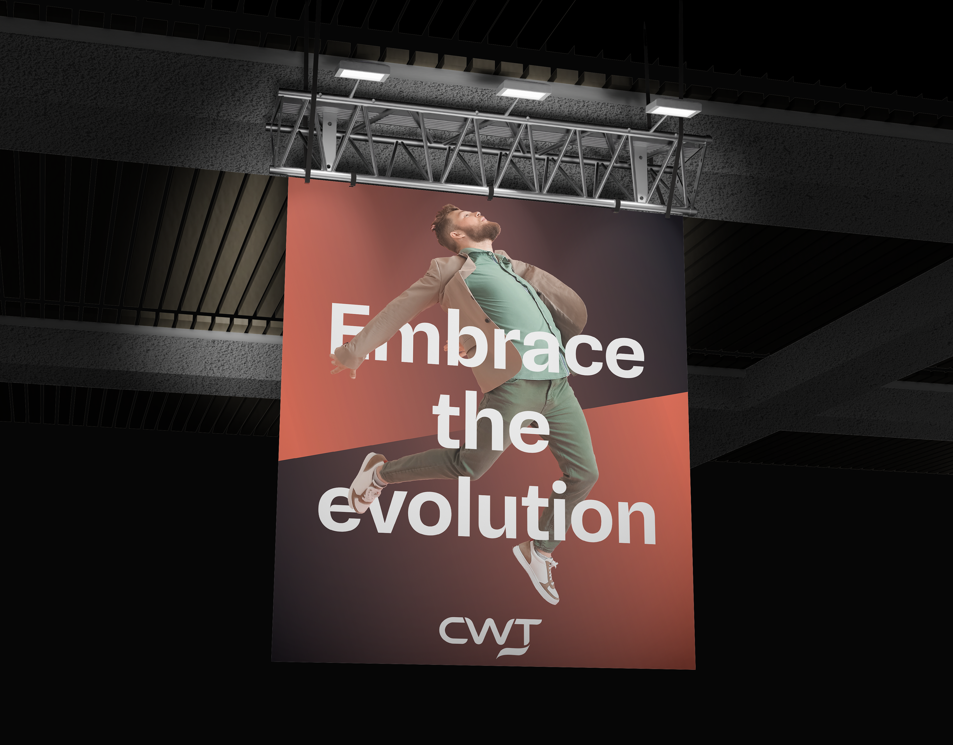
Global Brand Guidelines: Documented clear rules for logo clear-space, image direction, co-branding logic, and multi-platform applications into an intuitive, practical toolkit for internal design teams and regional agency partners worldwide.
The Impact
The updated guidelines successfully unified CWT's global communications across digital and print touchpoints. By prioritising digital accessibility and modernising key visual elements, the refreshed brand strengthened CWT’s market position as an inclusive, innovative, and forward-looking industry leader.