MARATHONS
FOR MIRACLES
The Challenge
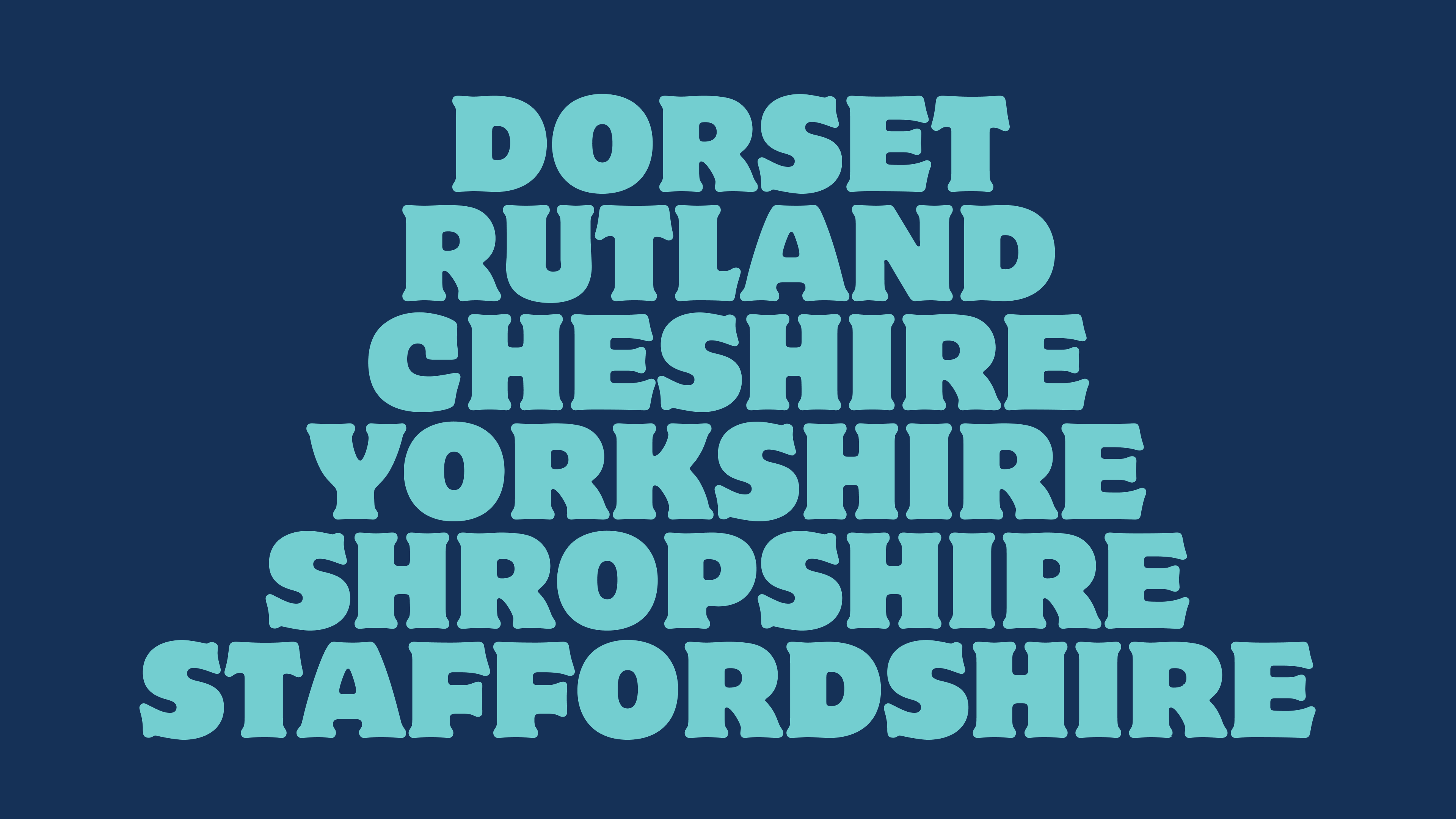
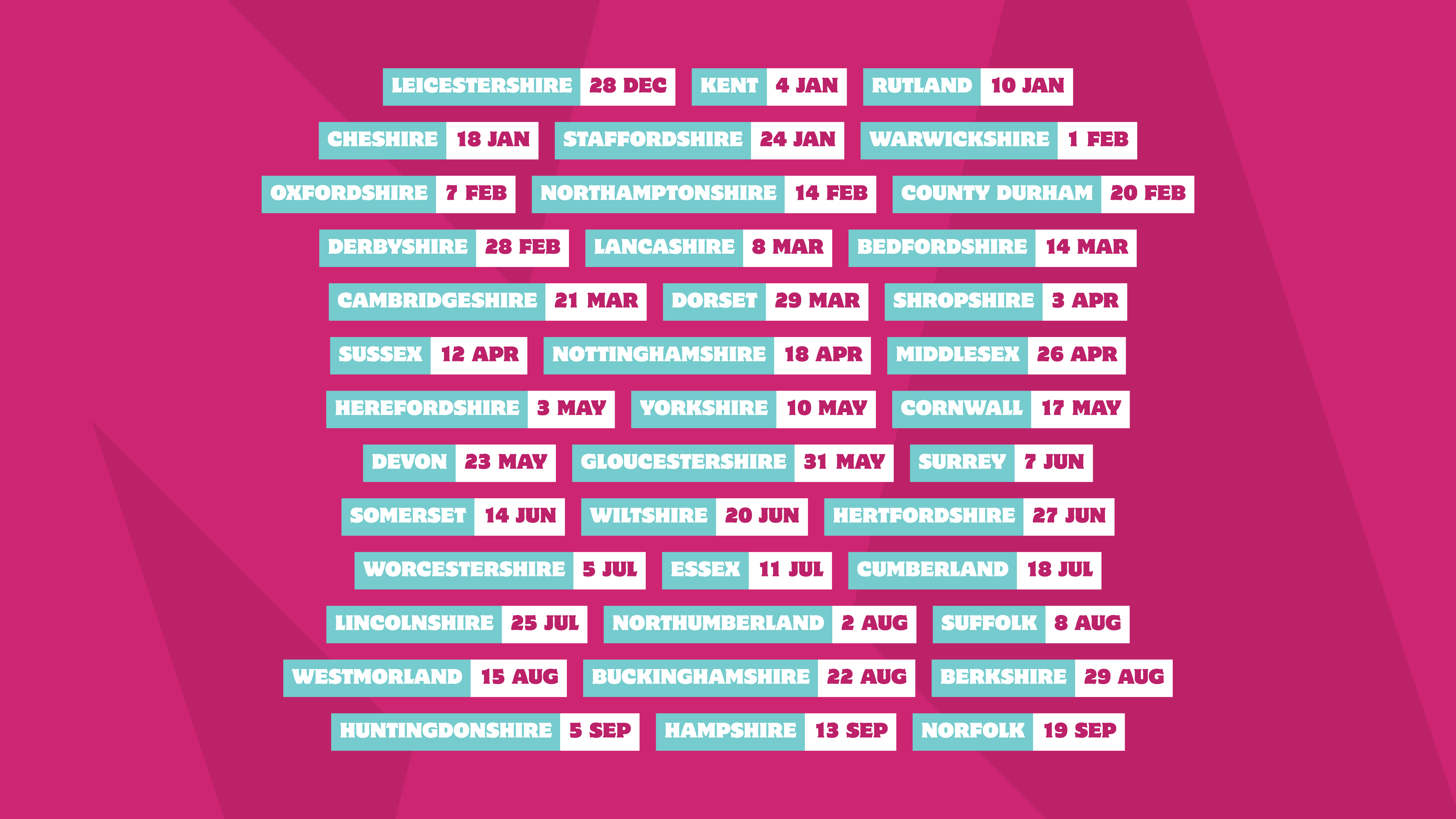
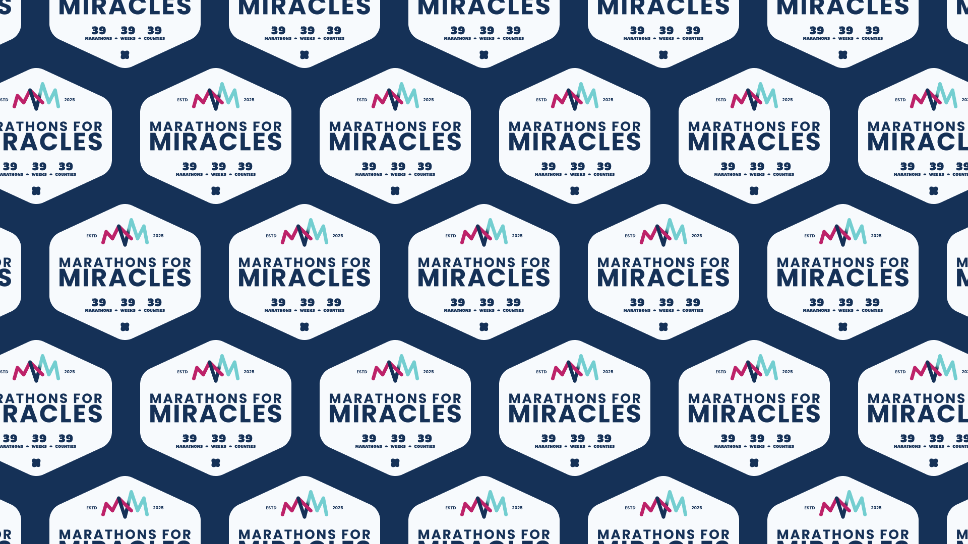
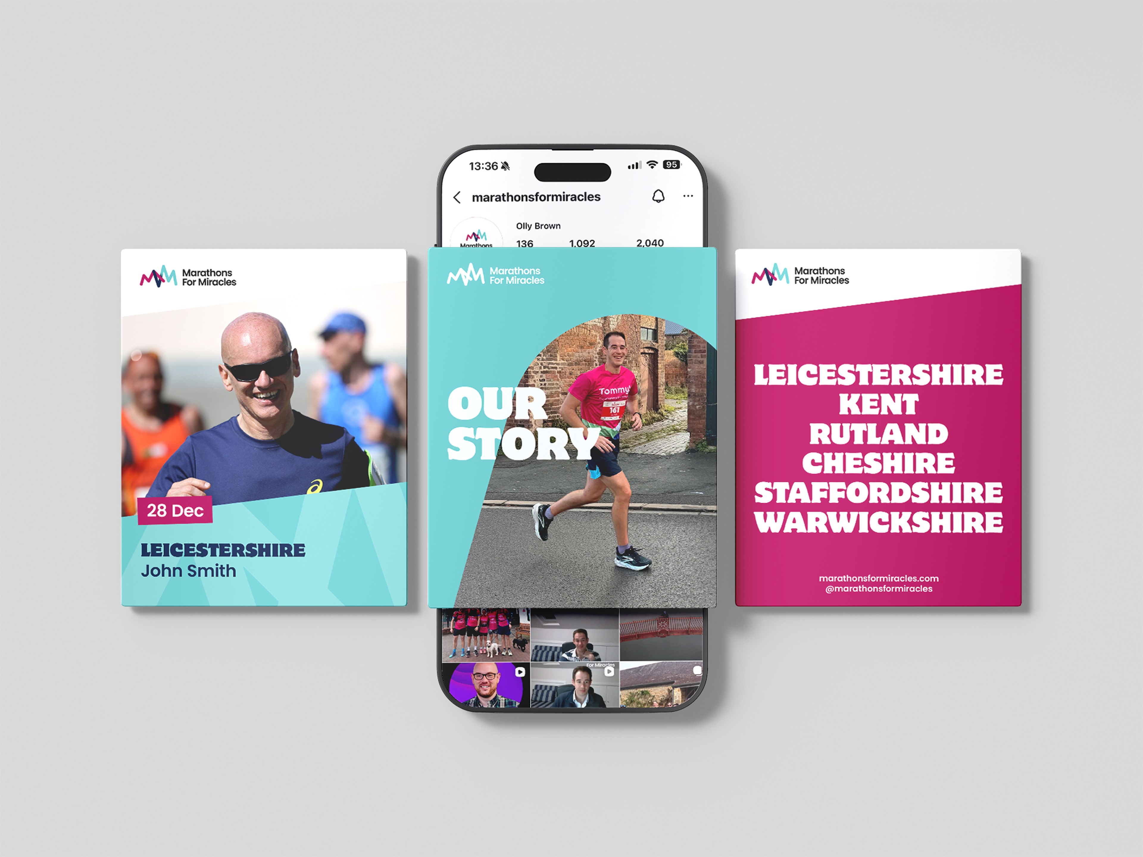
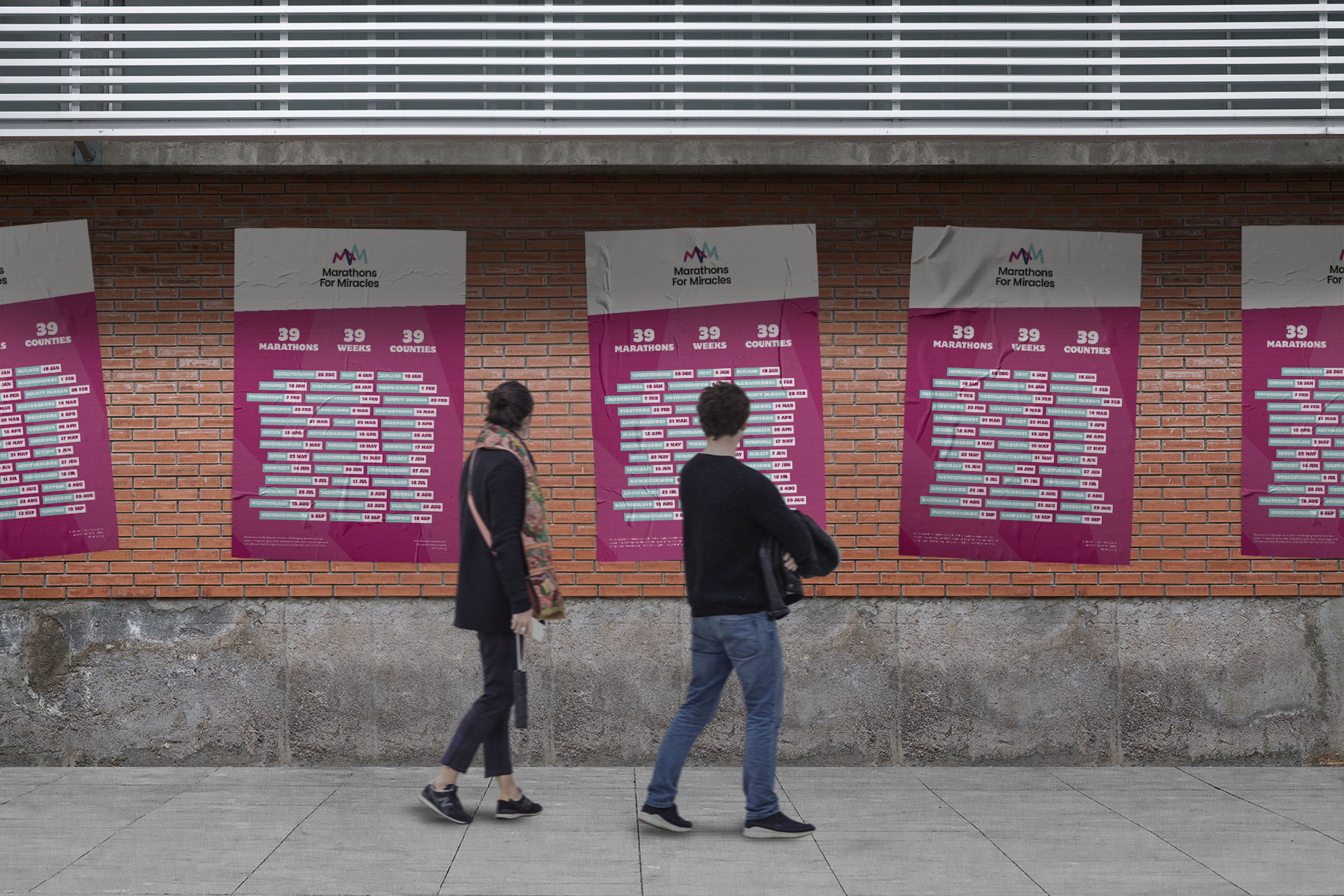
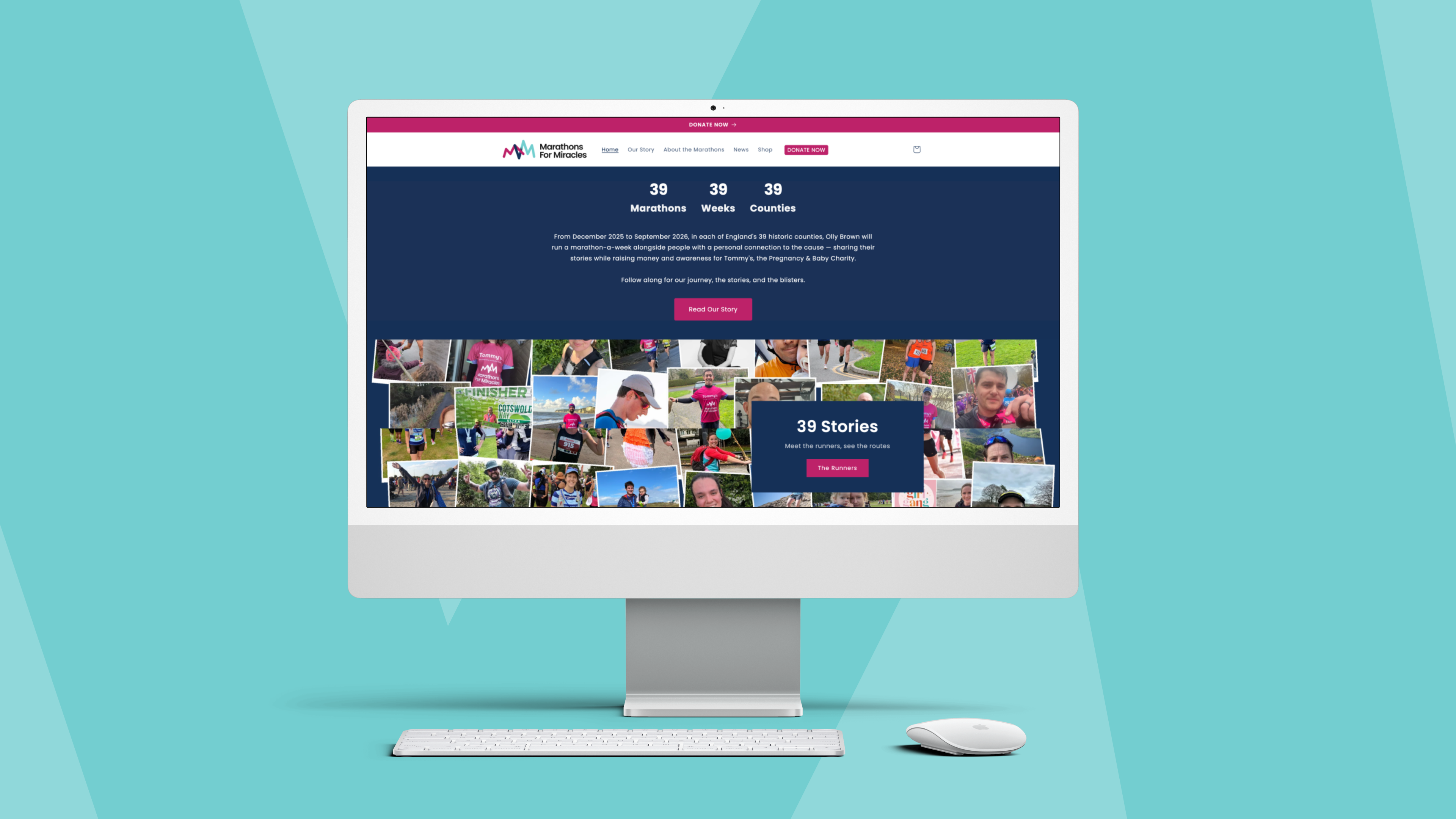
Marathons For Miracles is a high-endurance fundraising initiative for Tommy’s, the pregnancy and baby loss charity. The mission was staggering in its scale and symbolism: 39 marathons across 39 counties in 39 weeks, mirroring the duration of a full-term pregnancy.
While the cause was deeply personal, the project needed a cohesive visual identity that could transition from a personal mission to a national campaign. To break the silence surrounding baby loss and command attention across the UK, the founder needed a professional, "athletic-first" brand that could stand alongside major charity partners and professional sporting events.
The Strategic Solution
The design strategy focused on Meaningful Momentum. I wanted to create an identity that felt as gritty and determined as a long-distance runner, while subtly embedding the emotional heartbeat of the cause into every asset.
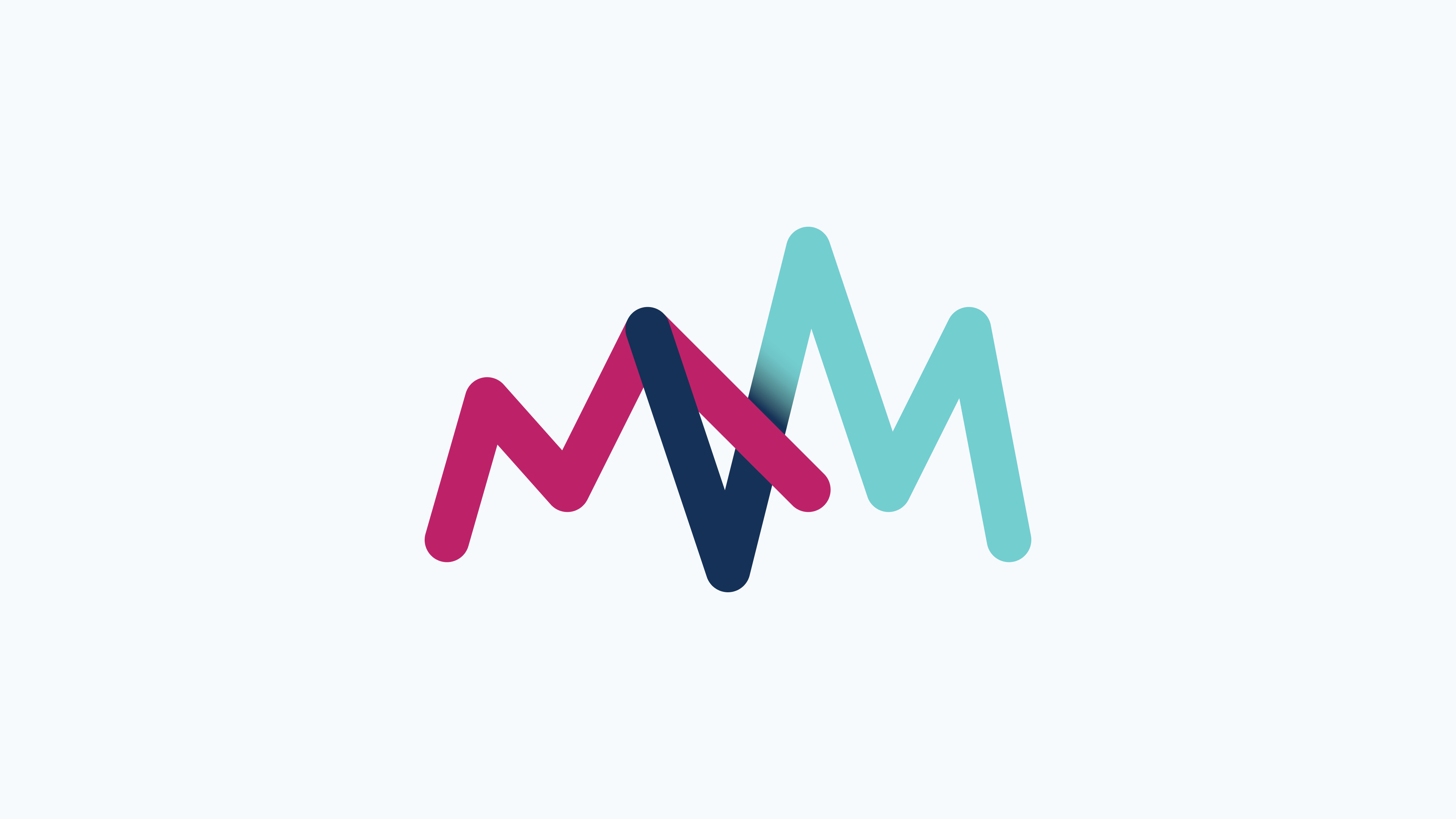
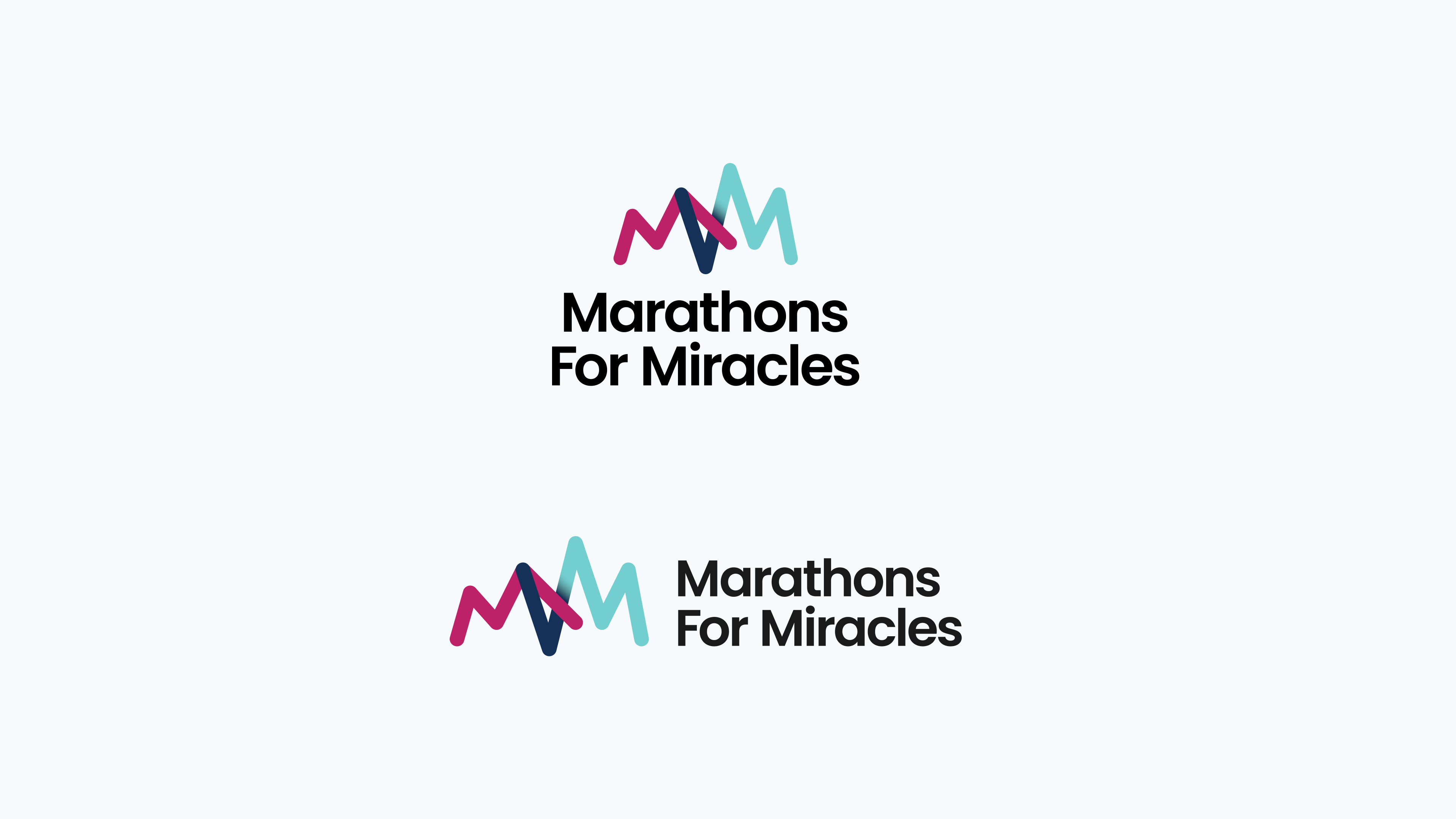
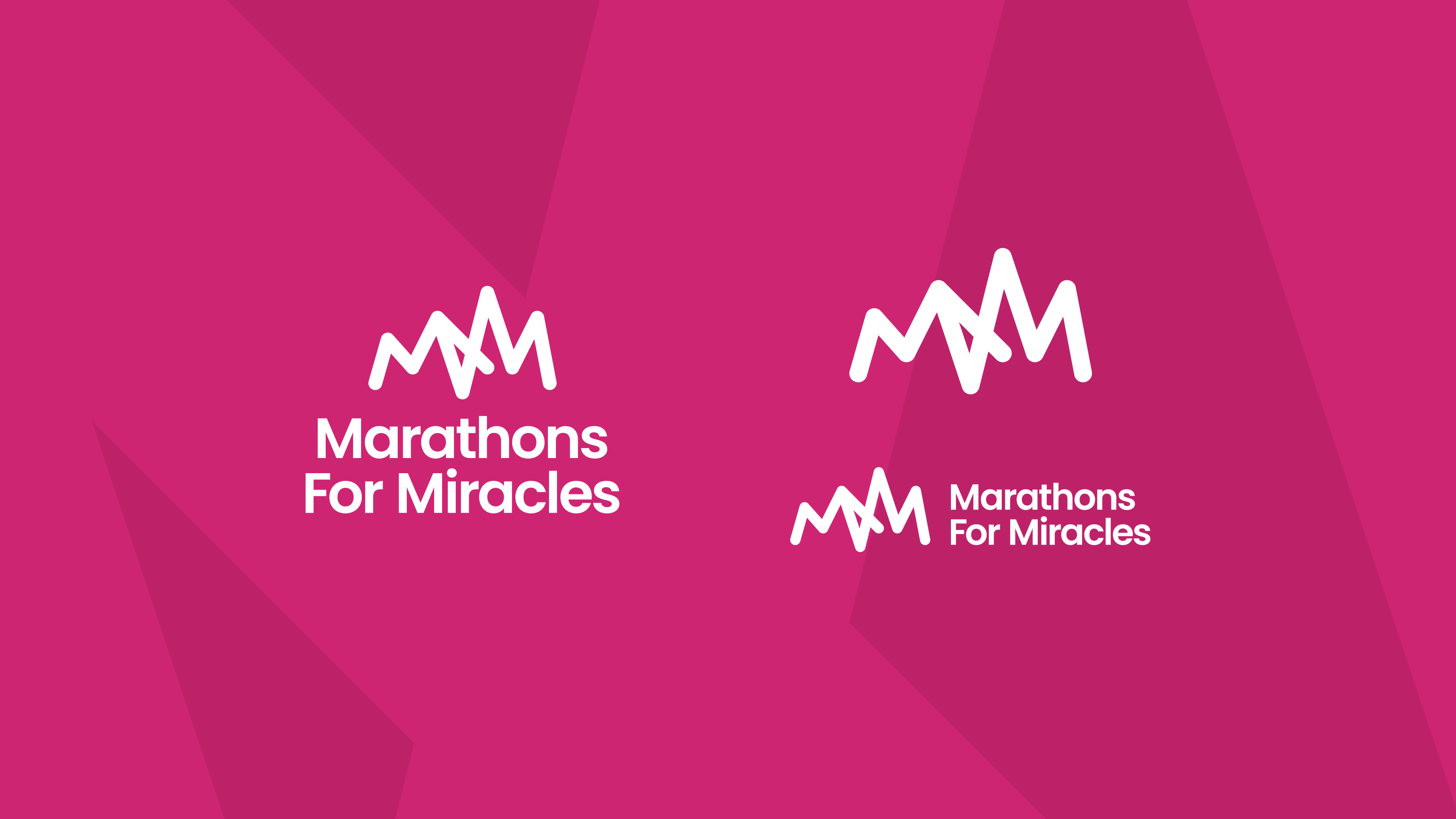
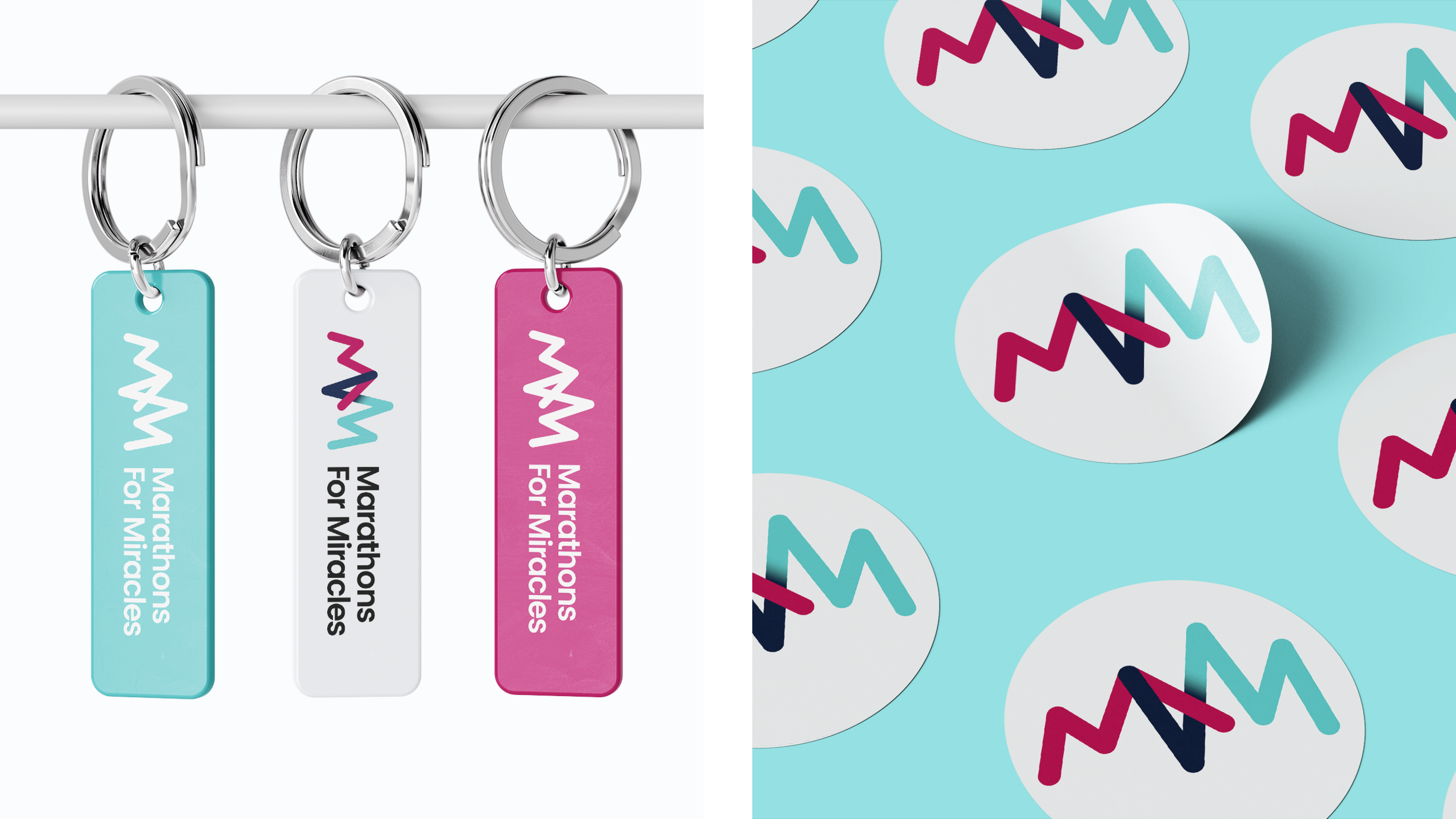
Engineering the mark: The primary mark is an abstract abbreviation of M4M. I designed the letterforms to double as a multi-layered metaphor: the "peaks and valleys" represent the physical ups and downs of a marathon, the undulating terrain of the 39 counties, and the steady pulse of a heartbeat. It’s a symbol of life, endurance, and the literal elevation of the journey.
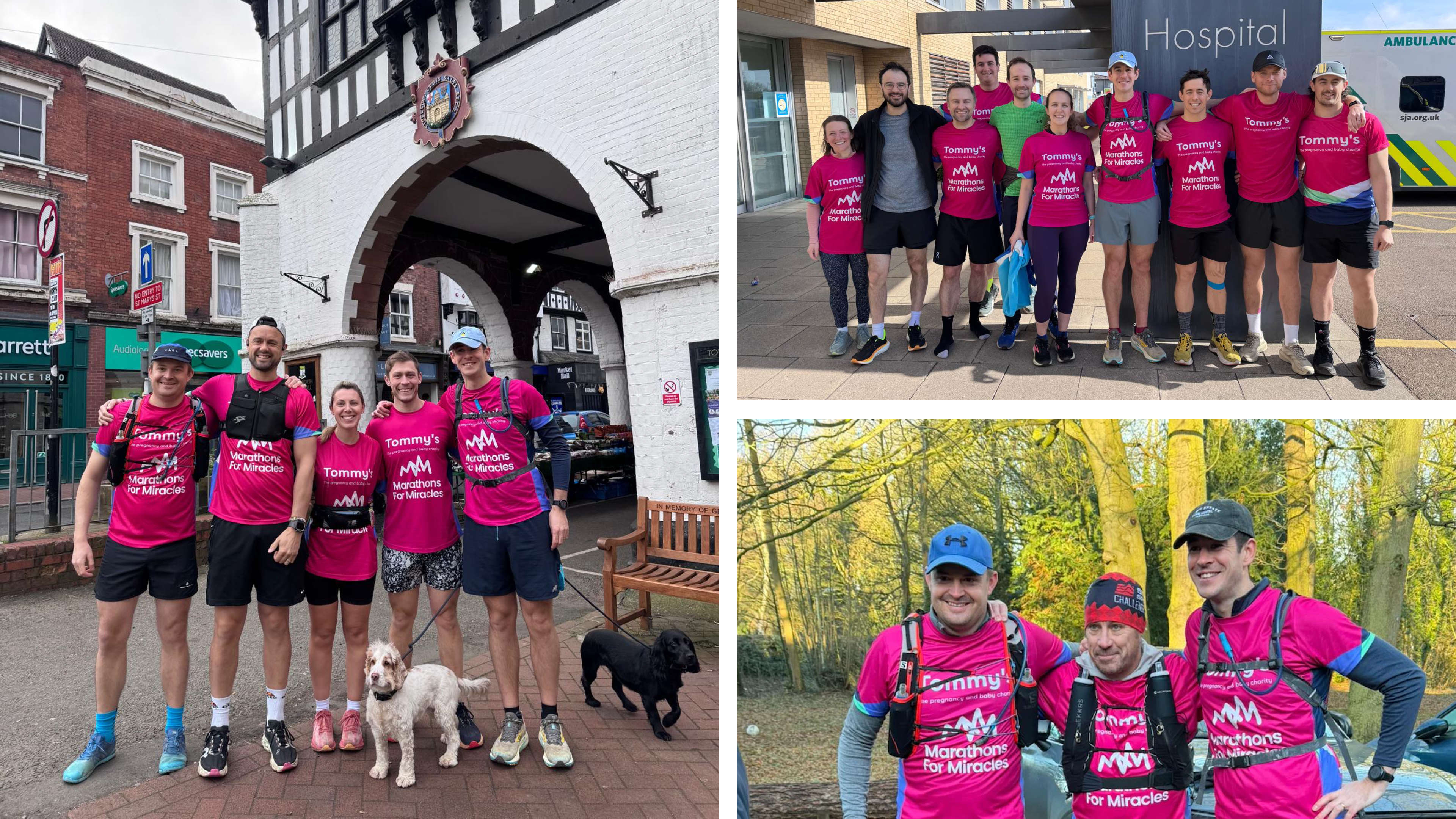
High-Impact palette: I chose an Electric Pink (a bold nod to the Tommy’s brand), paired with a Deep Midnight Navy and Aqua. This high-contrast pairing ensures maximum visibility on coastal paths, busy roads, and hospital grounds, creating a "loud" advocacy that stands out against the muted tones of traditional charity collateral.
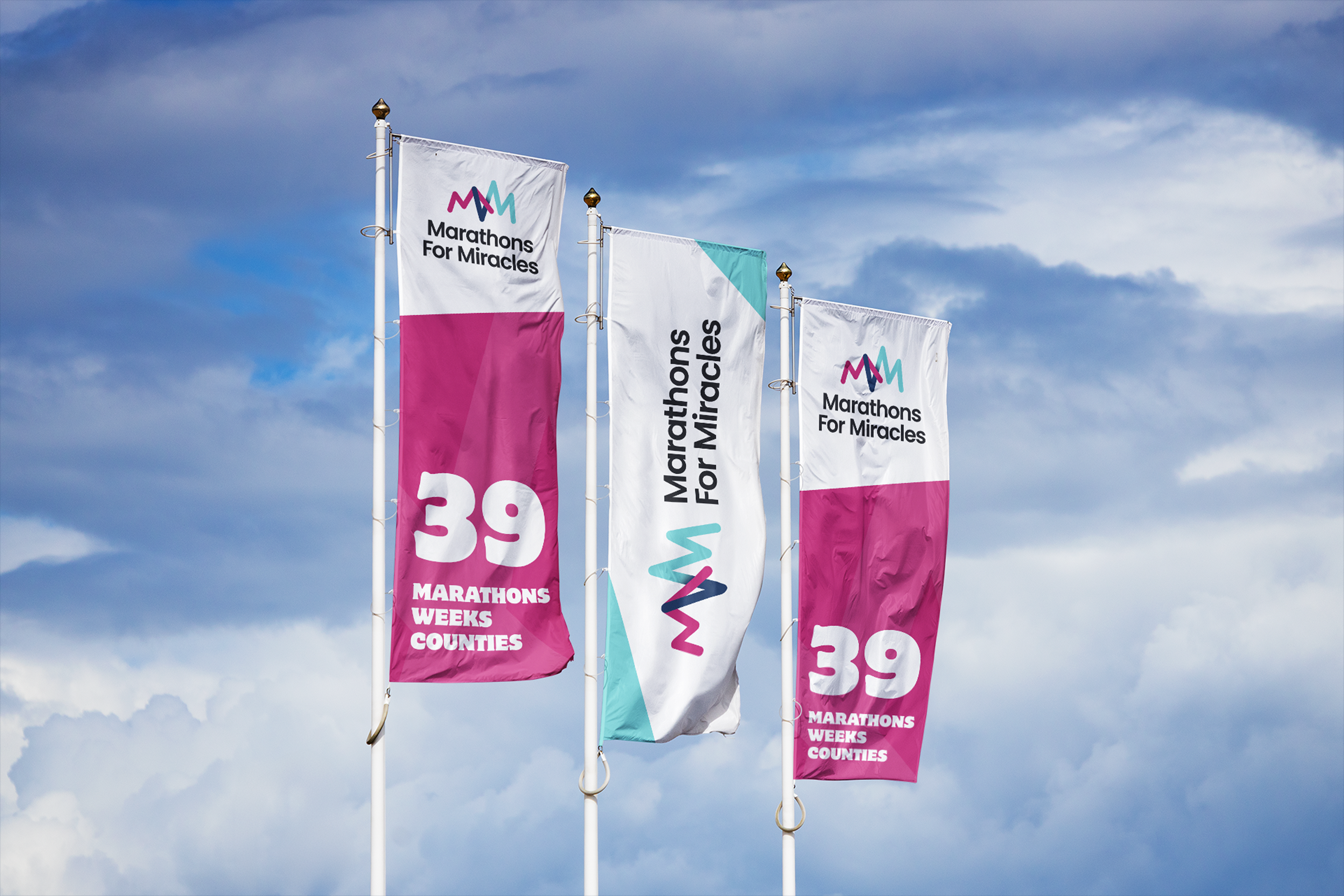
A scalable system: The identity was engineered for total versatility across a wide range of platforms and collateral. It needed to transition seamlessly between vastly different environments, from a compact 1:1 digital podcast cover and social media profile to high-visibility running jerseys, large-scale event flags, and high-impact vehicle livery that "owned the road" during the challenge.
Thank you to all the runners and supporters.
The Impact
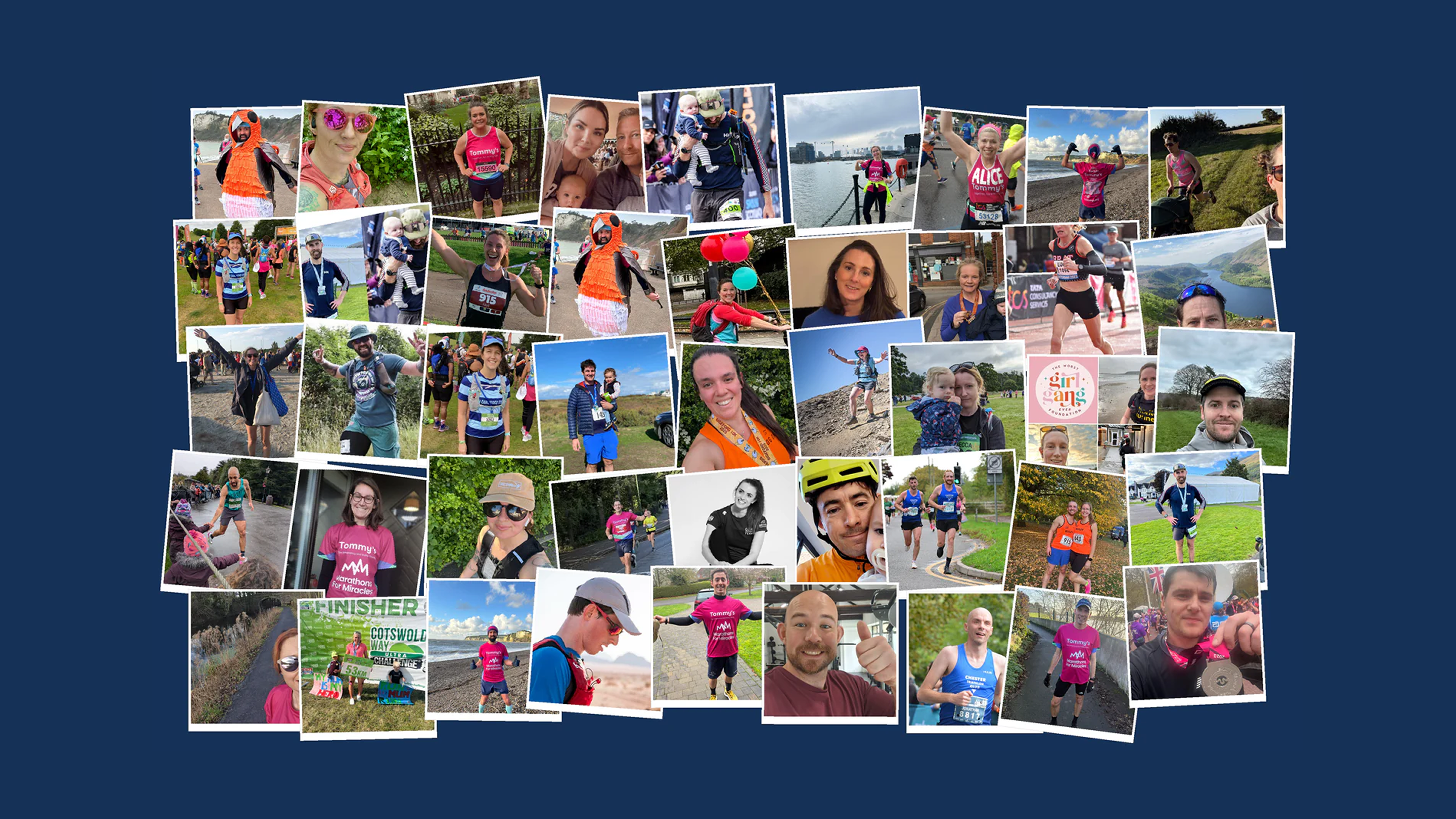
The result is a high-visibility brand system that transformed a personal challenge into a recognisable national movement. By establishing a professional, media-ready identity, Marathons For Miracles gained a commanding presence across the UK. The cohesive visual language provided a strong foundation for a heavy media presence, including features on local news outlets and the successful launch of the Marathons For Miracles Podcast, where the brand’s premium look resonated with the guests.
Equipped with this professional toolkit, the initiative successfully broke through the media noise. The brand was seen on the road, on the screen, and in the ears of listeners nationwide, building the authority required to turn a 1,021-mile run into a widely-followed media event and a powerful, unified voice for the cause.
The Team
Campaign Lead: Olly & Amy Brown
Identity & Design: Made By Stringer
Web: Will & Chrissy Ellison